Designing a Living On-Air Identity
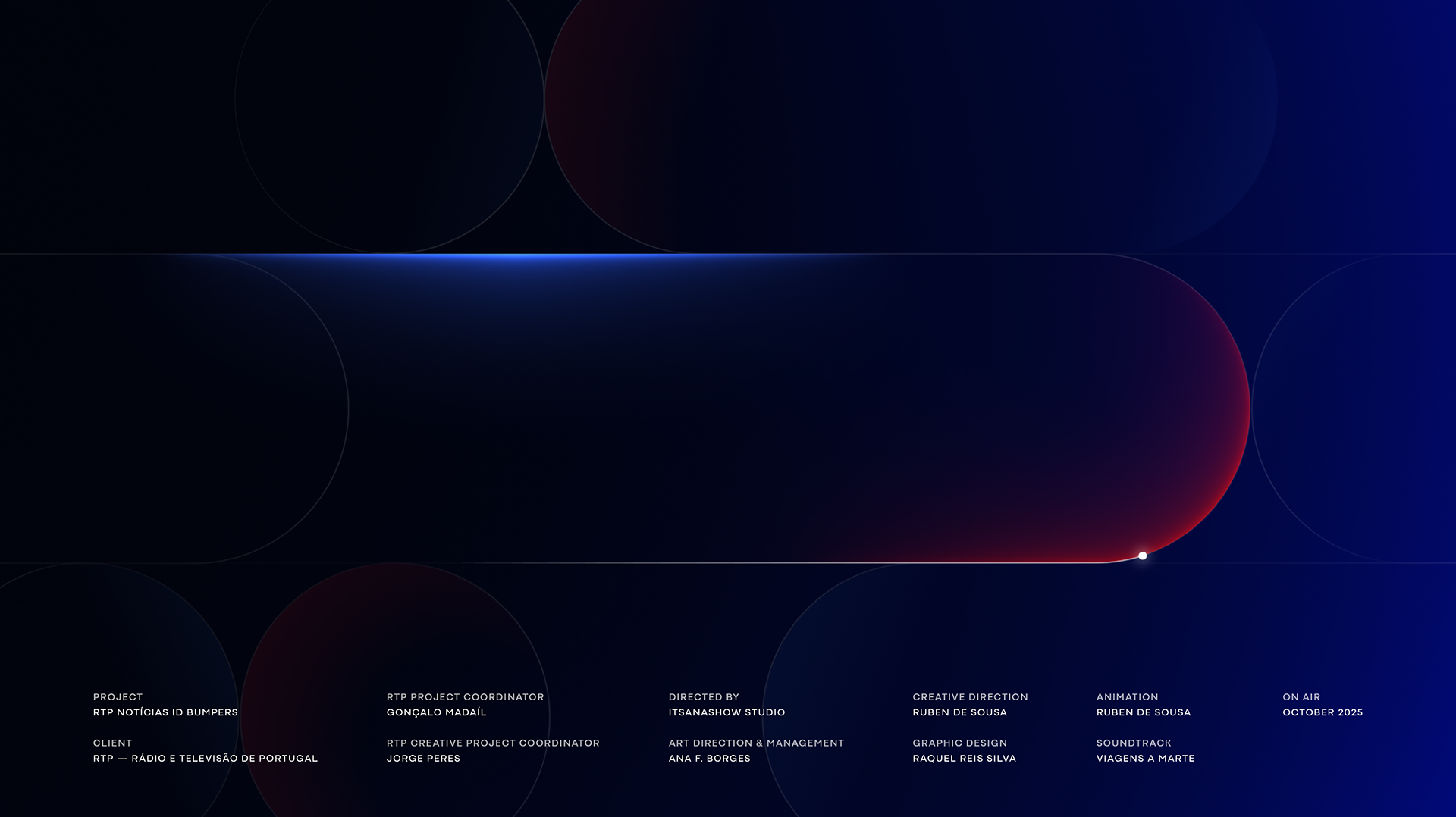
RTP Notícias
On-air identity system for Portugal's repositioned 24-hour public news channel, a strategic motion system built to perform, adapt, and hold authority across television, digital, and social, around the clock.
Alongside the full newscast rebrand, Itsanashow Studio was commissioned to develop the complete on-air identity for the repositioned RTP Notícias — formerly RTP3. While the corporate rebrand was handled by another agency, our mission was to take the approved channel logo and build everything around it: a functional, editorially driven identity system that could live, breathe, and evolve inside a 24-hour rolling news environment.
As Creative Director, I led the strategic and creative direction — from motion language and grid architecture to color strategy, Channel IDs, break bumpers, and the full promo package. Every decision was made with one question in mind: does this hold up under pressure?
***
Logo Animation
Here we defined the channel’s voice. The logo animation became the foundation of RTP Notícias’ on-air personality. Our approach was to honour the editorial weight of the brand, preserve the crisp clarity expected in news design, and introduce a subtle cinematic softness that adds depth without compromising urgency.
To achieve this, we explored a hybrid movement: fluid, organic and human in its first gestures, then precise, mechanical and editorial as it resolves.
The red accent plays a pivotal role. It was intentionally designed as a direct continuation of the Red Toggle logic established in the newscast identity, ensuring the channel logo animation remains fully aligned with the broader visual and motion ecosystem.

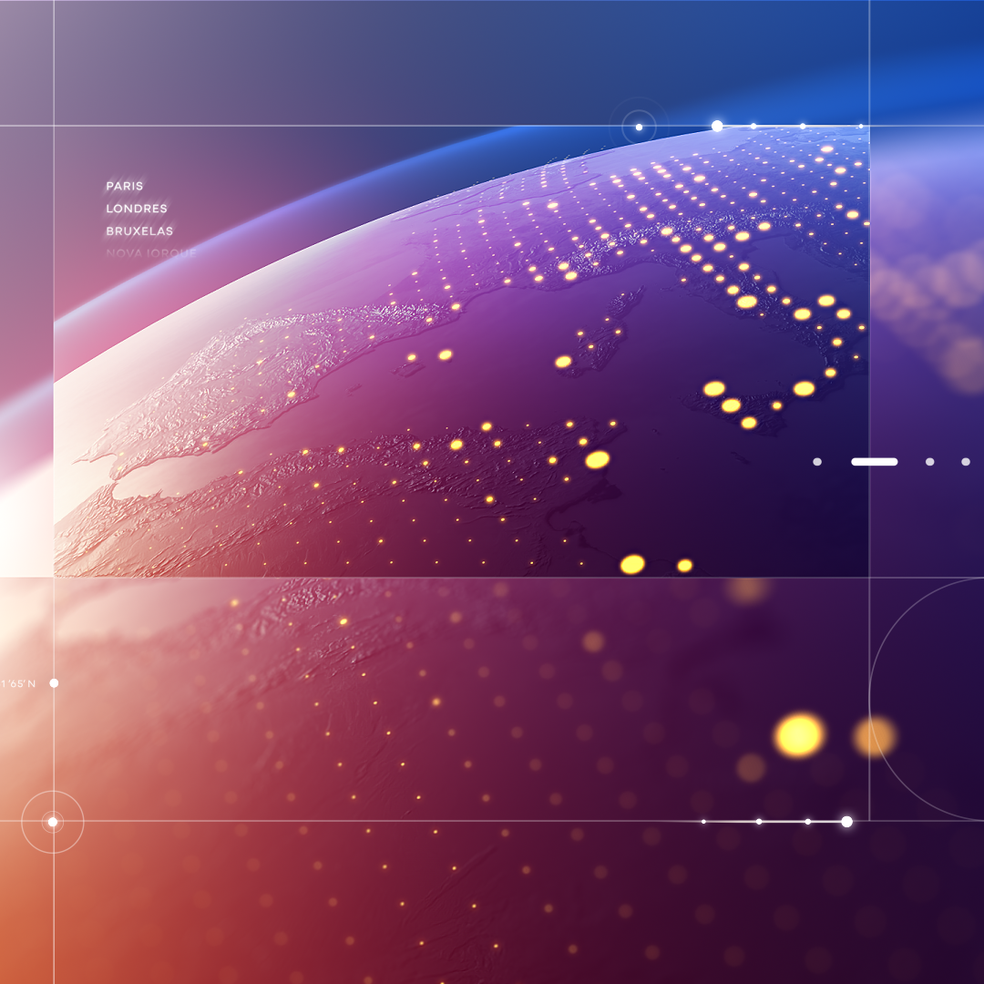
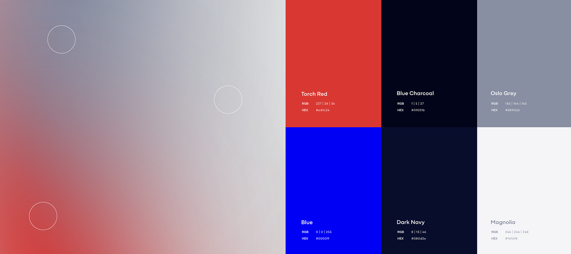
Grid System & Color Strategy
We created a flexible editorial grid, structurally inspired by the red accent of the channel logo, a detail that echoes the Red Toggle logic across the news ecosystem. This grid organizes all on-air elements, ensures visual coherence with the broader identity system, adapts seamlessly across every screen and platform, and acts as a metaphorical “window into the world”, reinforcing the channel’s commitment to trustworthy journalism.
The color strategy was crafted to balance credibility with visual precision. RTP’s signature blue provides institutional recognition, while news red introduces clarity of focus and editorial urgency. Deep blues and charcoal greys add neutrality and authority, complemented by glass-like whites and soft gradients that evoke transparency and modernity. Together, these tones support both the intensity of breaking news and the steady cadence of daily coverage.
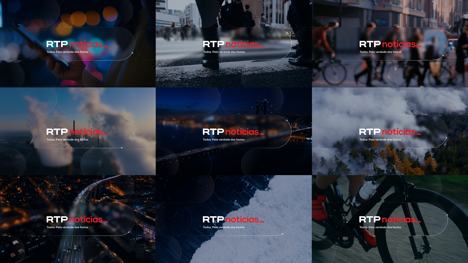
Channel IDs
For the pure branding moments, we developed minimal Channel IDs exploring logo structure, grid logic and restrained motion. We created two variants: Light Mode for clarity, neutrality and clean transitions, and Dark Mode for depth, focus and a more editorial atmosphere. Both versions reinforce consistency and recognisability, essential for a 24-hour news channel.
We also designed imagery-driven IDs featuring dynamic grid overlays, controlled focus and defocus, a glass-inspired aesthetic and atmospheric lighting cues. These variations extend the “window to the world” metaphor while allowing flexibility for diverse themes and editorial contexts.

Break Bumpers
For RTP Notícias’ on-air transitions, we developed clean, neutral and understated break bumpers designed to give the channel “space to breathe”. These moments act as a visual reset — a brief pause that balances the intensity and constant stimulation of rolling news, helping the viewer refocus before returning to coverage.
Our approach is intentionally minimal: soft gradients, controlled light behaviour, precise understated transitions, subtle transparency effects and restrained red accents, creating a calm compositional pause without breaking the channel’s rhythm. The graphic logic remains intentionally discreet, almost invisible, ensuring the break feels natural and editorially consistent while reinforcing RTP Notícias’ authority and clarity on air.
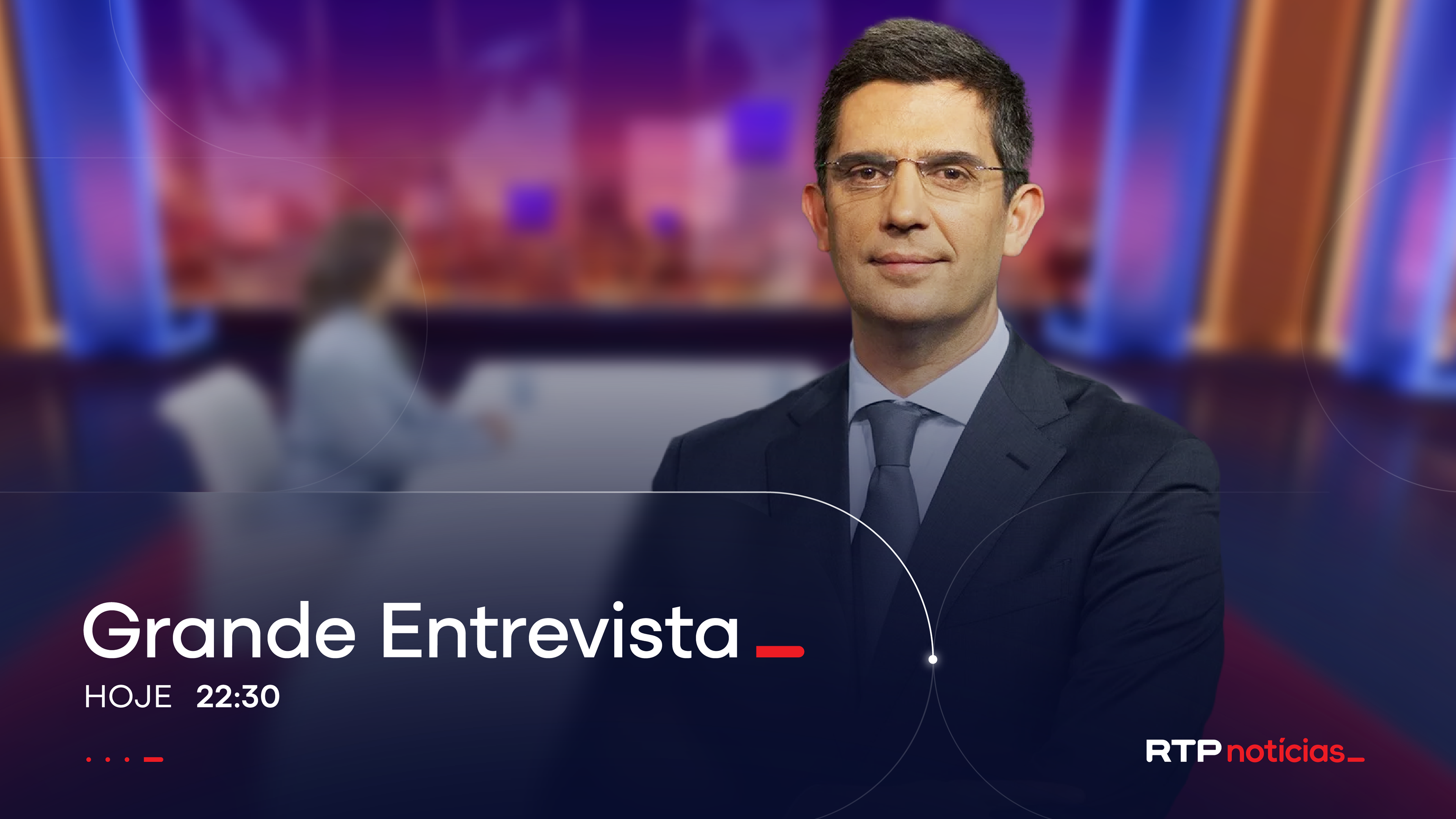
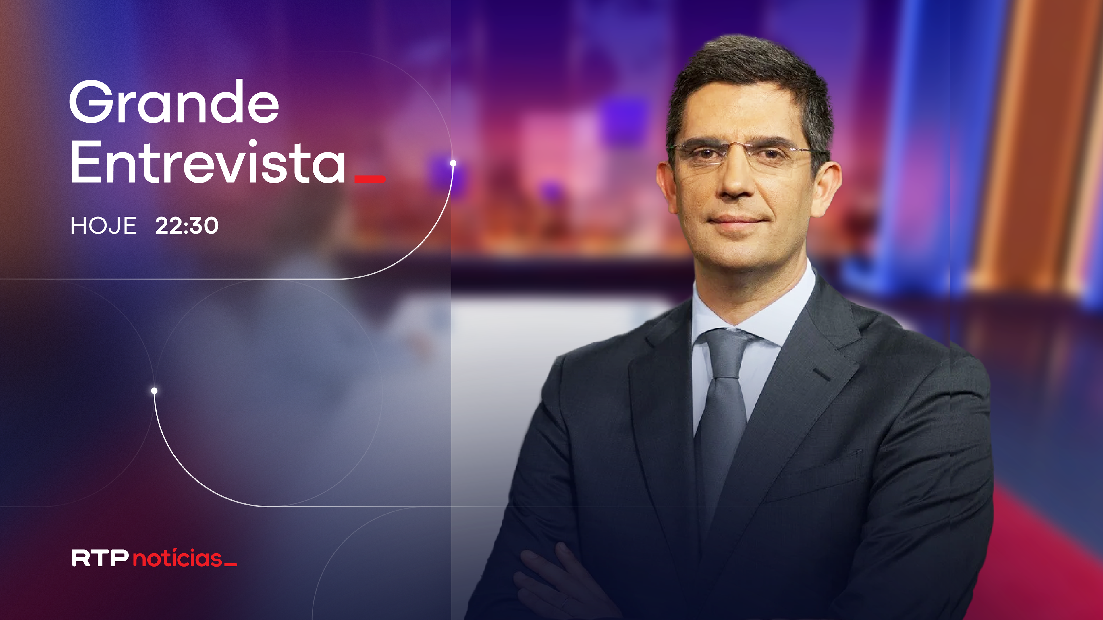
Program Promo Package
We designed a Program Promo Package that extends RTP Notícias’ visual and motion language into a clear, cohesive on-air communication tool. The glass-blur aesthetic becomes the signature canvas, creating a refined and editorial backdrop that highlights program imagery without overwhelming it. Minimal typography, restrained color accents and the omnipresent grid ensure consistency, hierarchy and recognisability across all promos.
Transitions between footage and imagery adopt a smooth swipe-like behaviour inspired by UI behaviour, reinforcing the channel’s modern, cross-platform identity and creating a seamless connection between content, interaction logic, and broadcast motion.
The result is a promo system that feels confident, contemporary and unmistakably RTP Notícias, adaptable to any programme, topic or editorial tone, while never losing its voice. Audience response confirmed it: when identity is this consistent, people notice. Even if they can't say why.