Truth Has a New Look
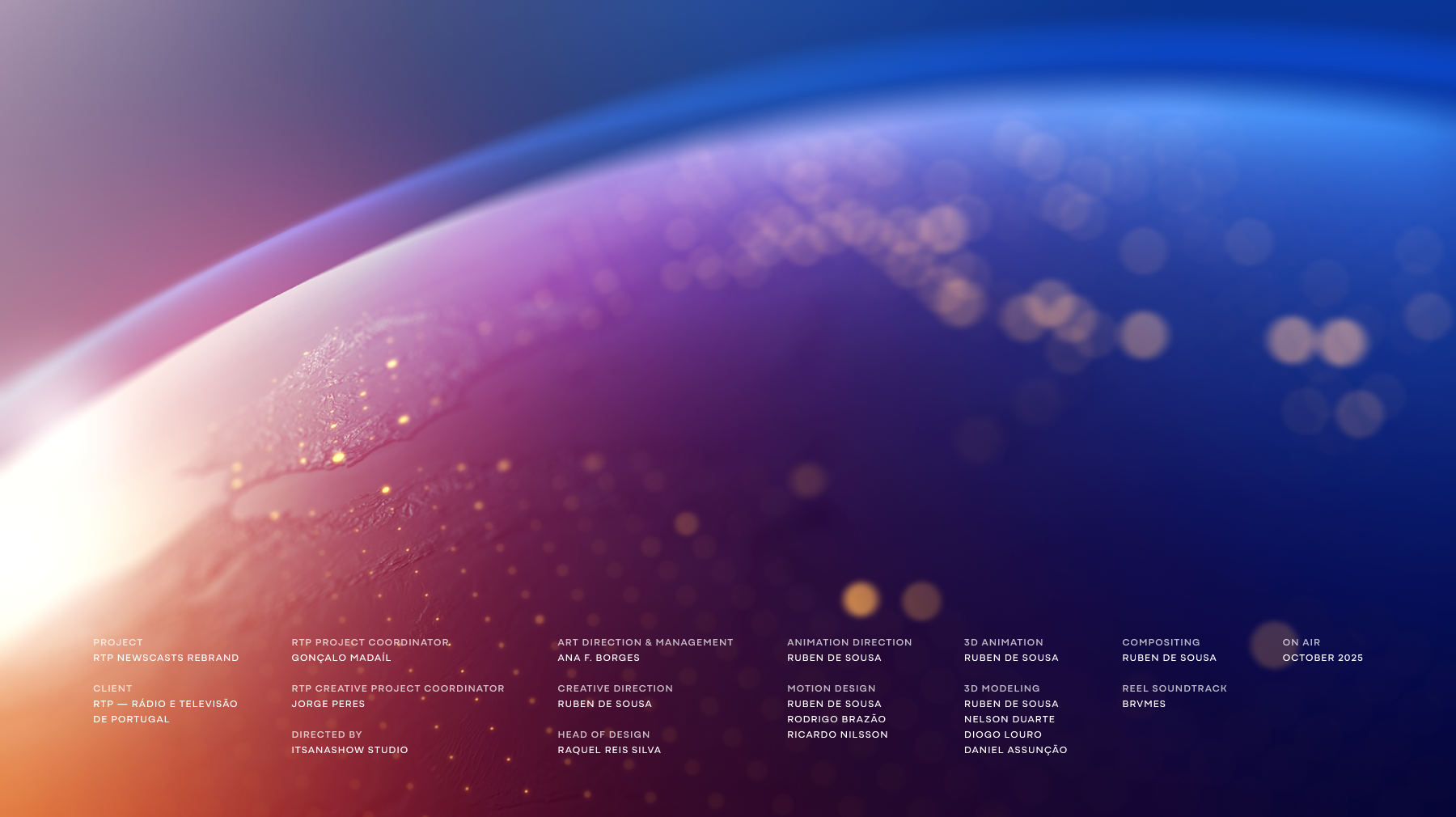
RTP Newscasts Rebrand
A complete visual identity and motion system for Portugal's public broadcaster, spanning 7 channels and 6 signature programs, built on a single, unified design language.
When RTP invited Itsanashow Studio to reimagine its news division, the brief went far beyond aesthetics. In a media landscape increasingly shaped by misinformation and algorithm-driven noise, the challenge was strategic: how do you make trust visible?
As Creative Director, I led the design and motion strategy across the full rebrand, from the first principles to the final frame. The result is a cohesive visual and motion system rooted in three guiding values: Transparency, Objectivity, and Credibility.
Developed over more than a year in close collaboration with RTP's in-house team, the project touched every layer of the broadcaster's news presence: openers, on-air graphics, channel IDs, break bumpers, and promo systems, across 7 channels and 6 individual program identities. A unified system where brand strategy, motion design, and editorial thinking work as one.
The rebrand was met with strong enthusiasm both from RTP's team and from audiences, a response that confirmed what good broadcast design should always do: feel inevitable.
Explore the full project in two chapters:
Openers → The creative and motion process behind the newscast identity
On-Air Identity System → The strategic system powering RTP Notícias 24 hours a day
***
1. The Newcast Identity
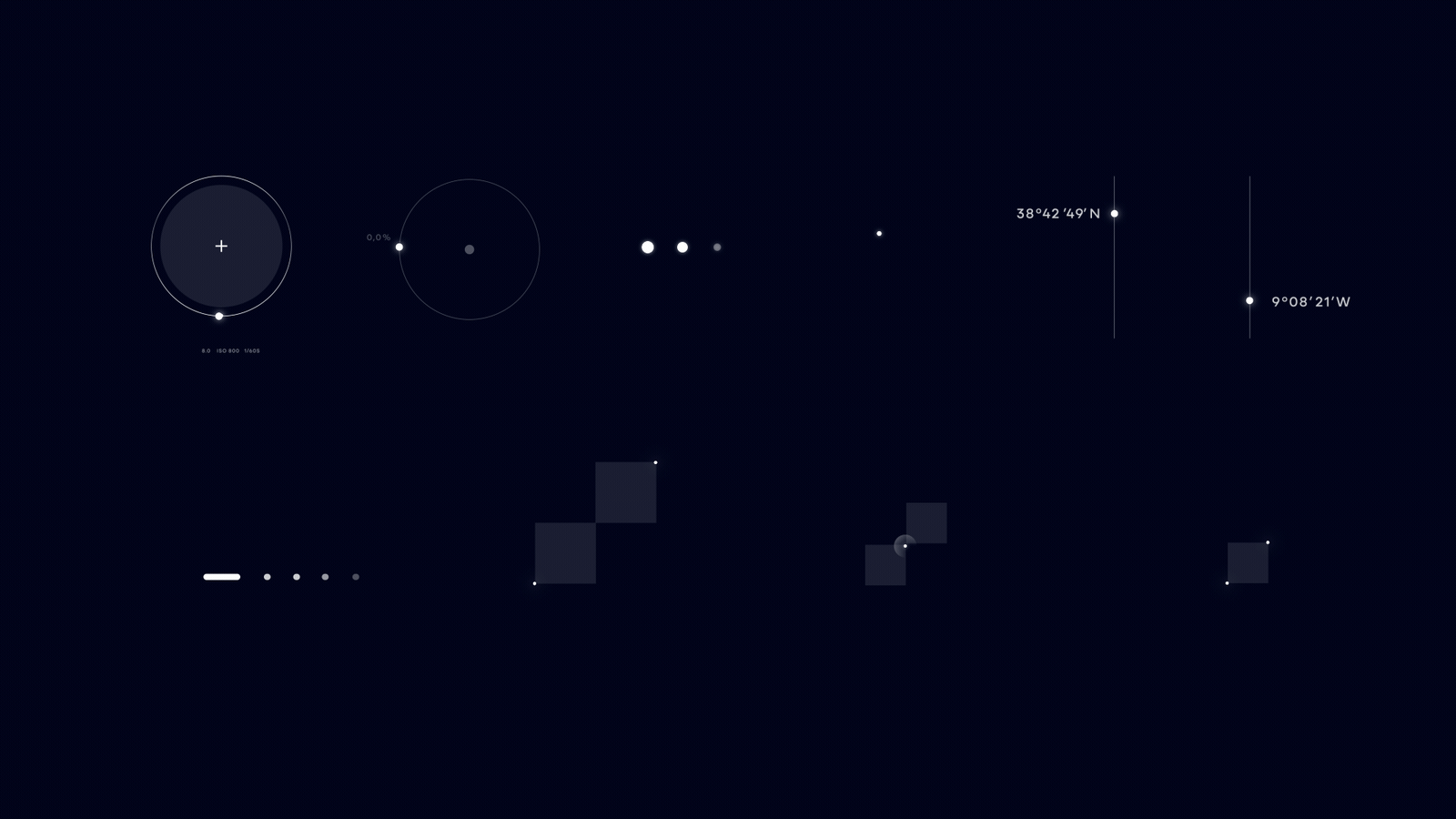
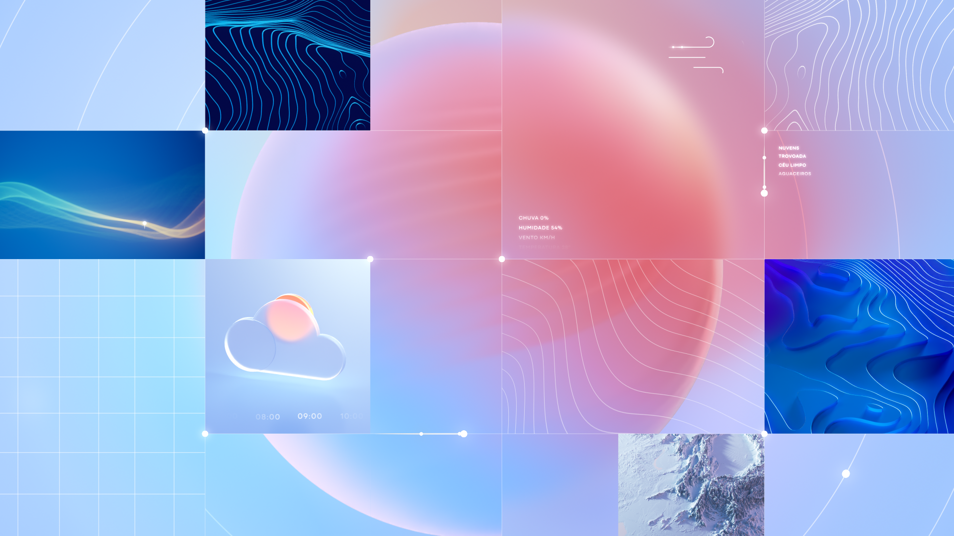
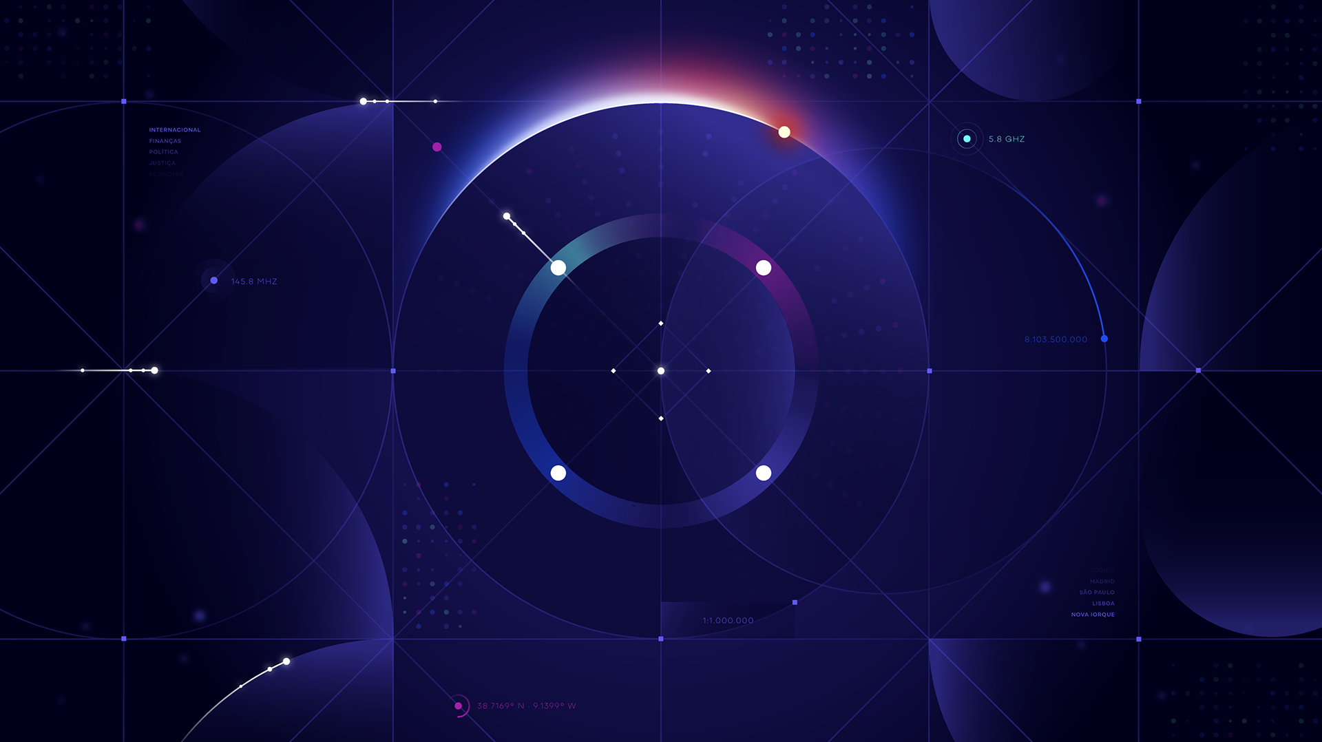
Each opener is a visual story about time, light, and information.
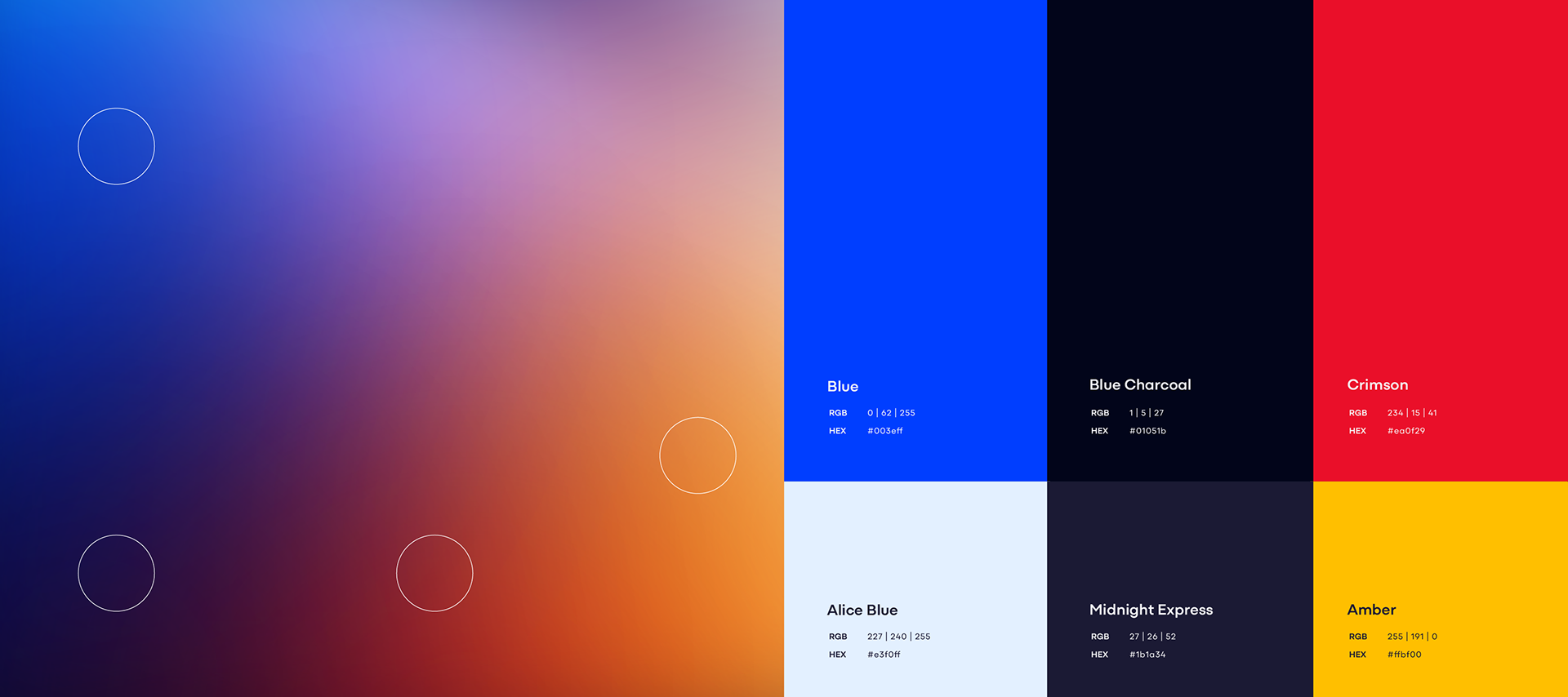
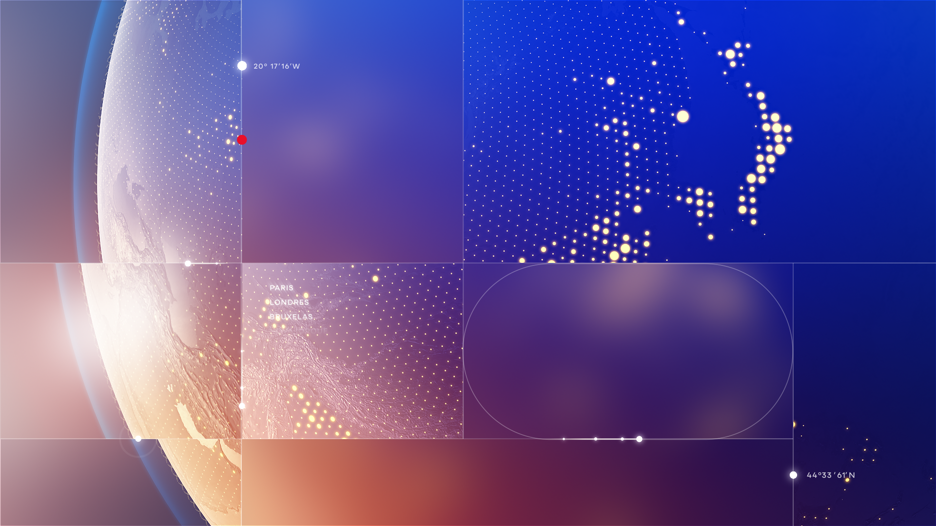
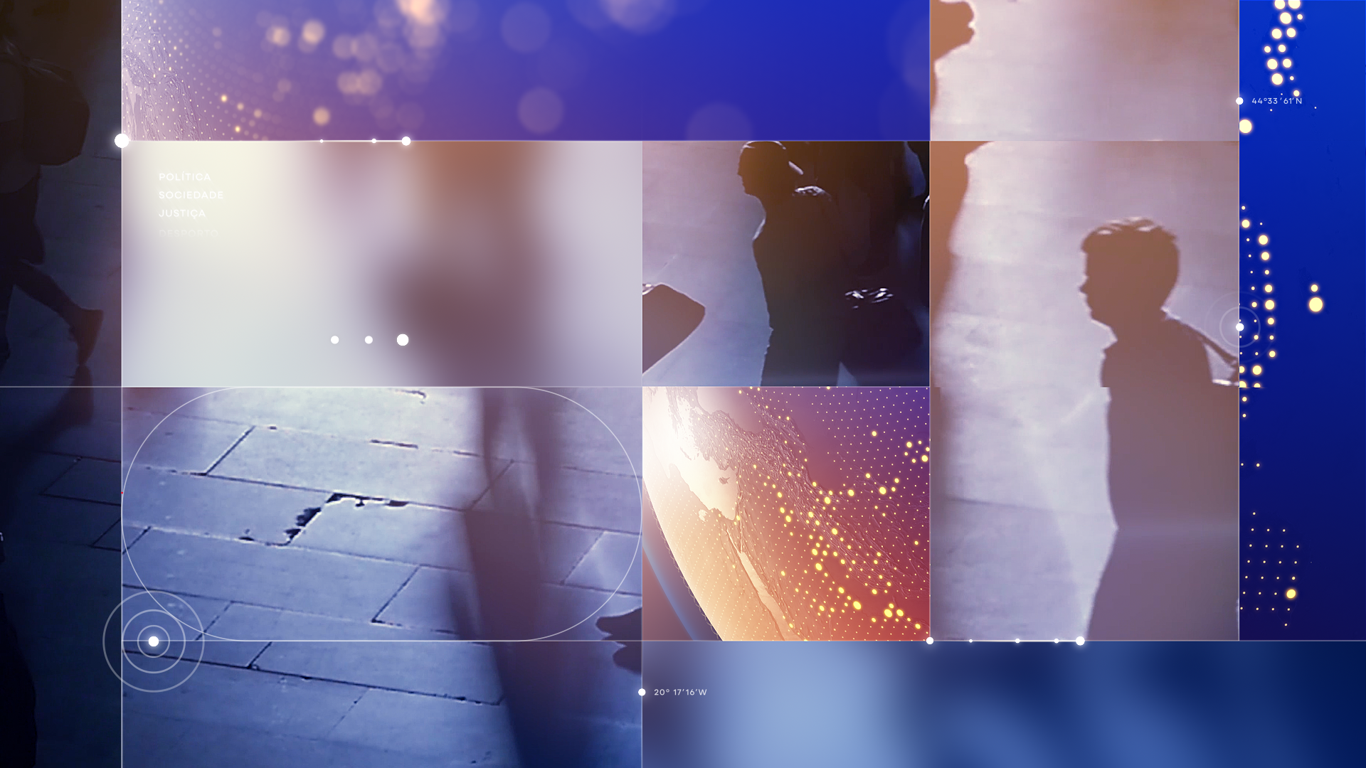
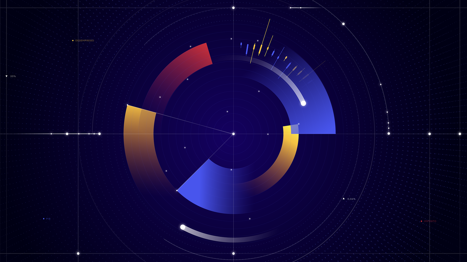
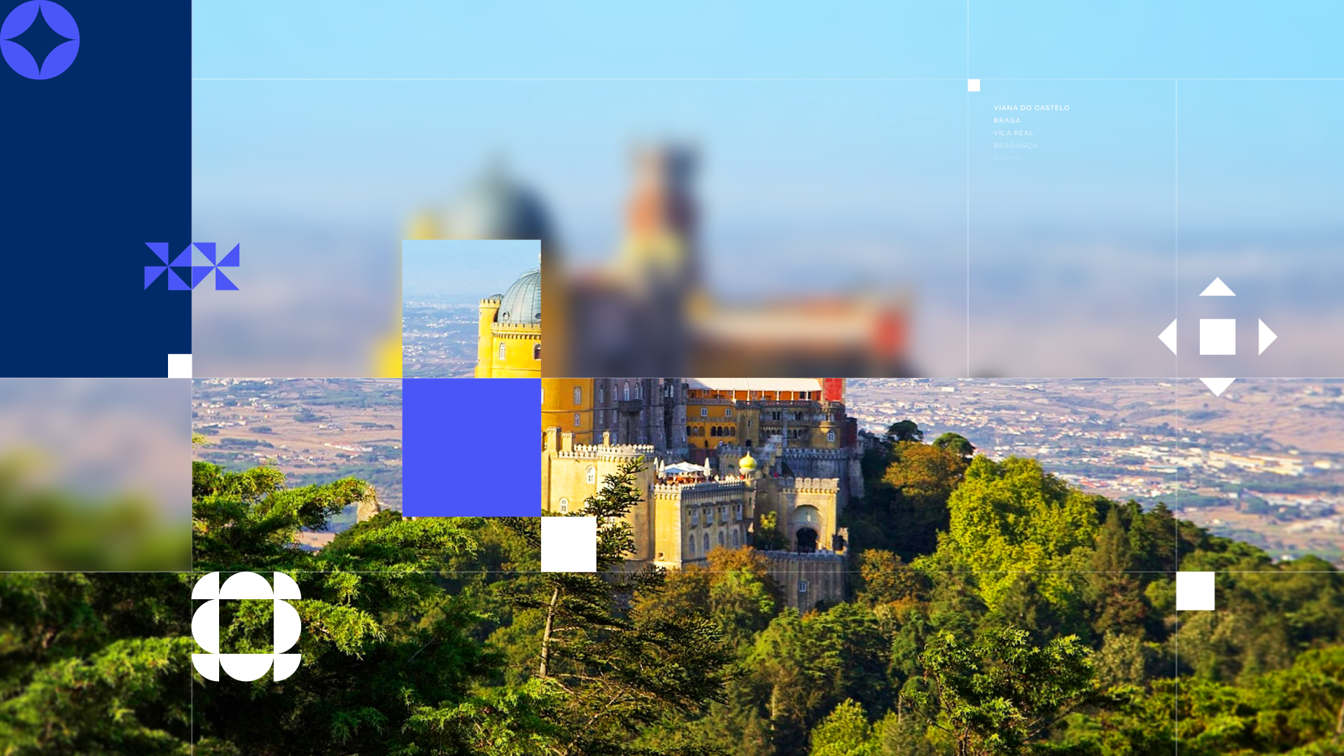
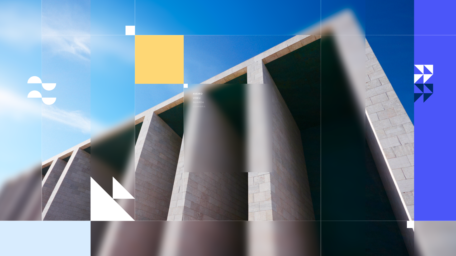
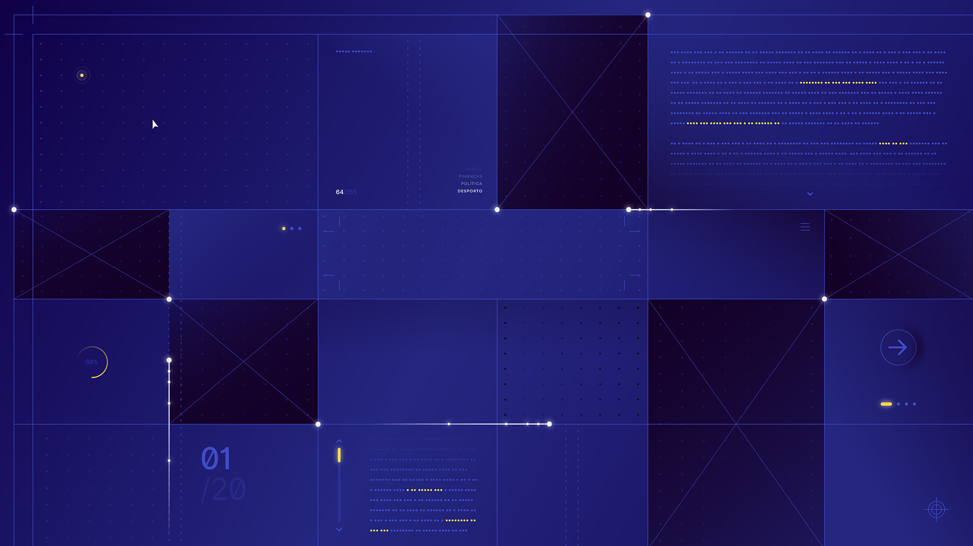
A living grid pays homage to print journalism, while a glass-inspired aesthetic brings light, truth, and depth to the screen. A 3D globe with animated markers highlights RTP’s global presence, while evolving color gradients follow the rhythm of the day, from dawn to late edition.
A living grid pays homage to print journalism, while a glass-inspired aesthetic brings light, truth, and depth to the screen. A 3D globe with animated markers highlights RTP’s global presence, while evolving color gradients follow the rhythm of the day, from dawn to late edition.
The motion language is inspired by familiar gestures such as swipe, tap, and scroll, bridging the world of digital media with broadcast tradition.
At the center, the red toggle, drawn from RTP’s iconic broadcast lines, orchestrates every transition, the pulse that drives this new visual symphony.


2. RTP Notícias Channel ID Bumpers
For the new RTP Notícias, we designed a visual system that is elegant, confident, and precise. A sober palette with soft gradients and a glass finish conveys truth and transparency, while motion remains fluid yet concise, echoing journalistic discipline.
Built around the geometry of the RTP Notícias logo, the grid acts as a metaphor: the channel as a window to the world, where light, structure, and information meet.