A New Visual Language for National News

RTP (Rádio e Televisão de Portugal) is Portugal's public service broadcasting organization, operating four national television channels, three national radio stations, and several satellite and cable offerings. Itsanashow Studio was commissioned to develop a comprehensive new visual identity for every newscast program across the network.
This case study is presented across five chapters: Teaser · Openers · On-Air Graphics · Infographics · Studio Ledwall Backgrounds. Starting with the Teaser, the first glimpse of the new visual identity.
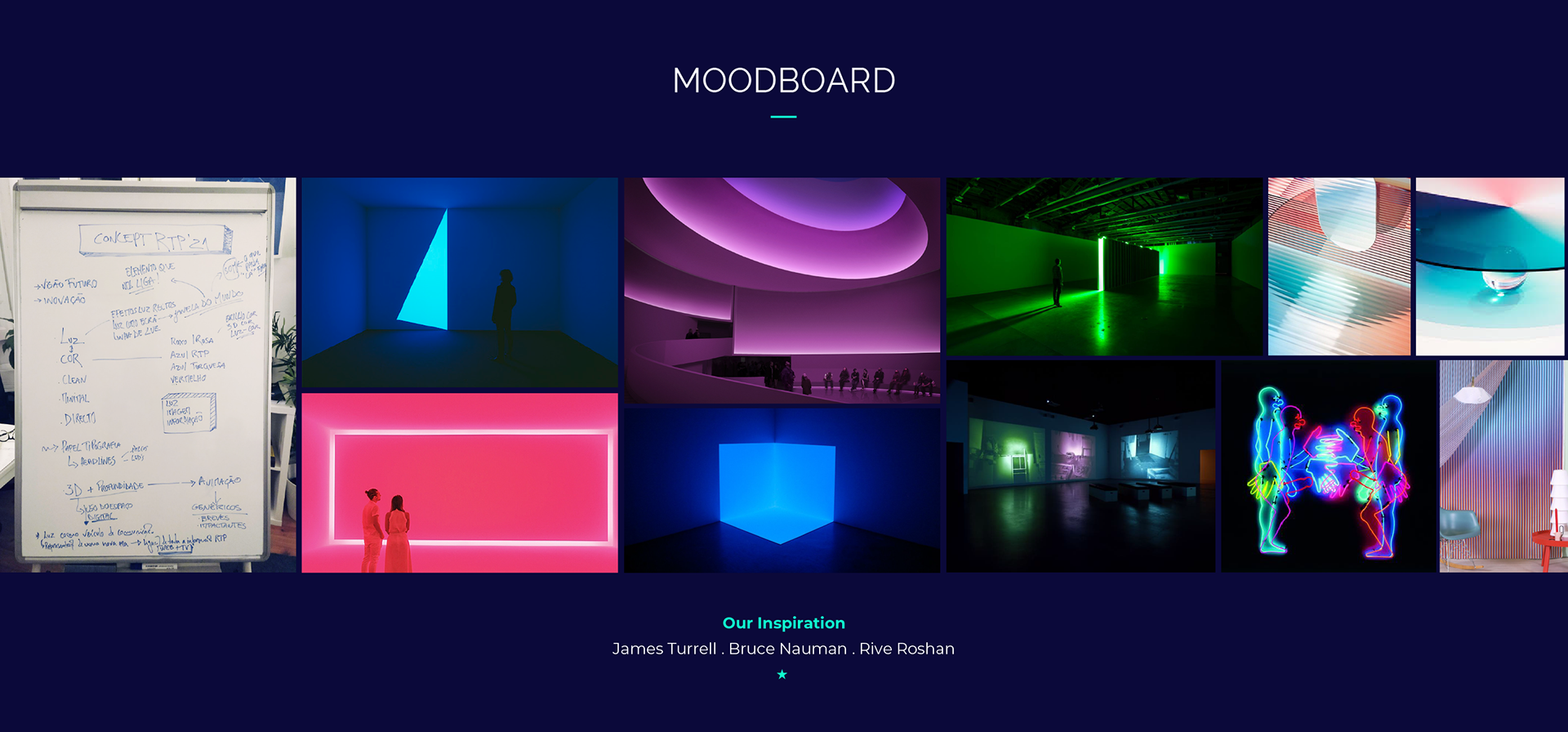
Light . Image . Information
These are the main pillars of our graphic identity. Light became a metaphor for a window to the world. A window in which the screen appears as an information vehicle. Which unfolds on the various digital platforms.
We chose to be daring along with strong and vibrant colours. An elegant, multifaceted sans serif typography. Adapted to all types of screens. Simple and straightforward layout infographics. Favouring adaptability to various formats. Sophisticated 3D work for the intros where light plays a leading role. The animations are fluid, organic, and captivating. They guide the viewer's attention along with the news narrative.