Where Identity Lands on Trust
Reimagining the Visual Identity of RTP’s News Division.
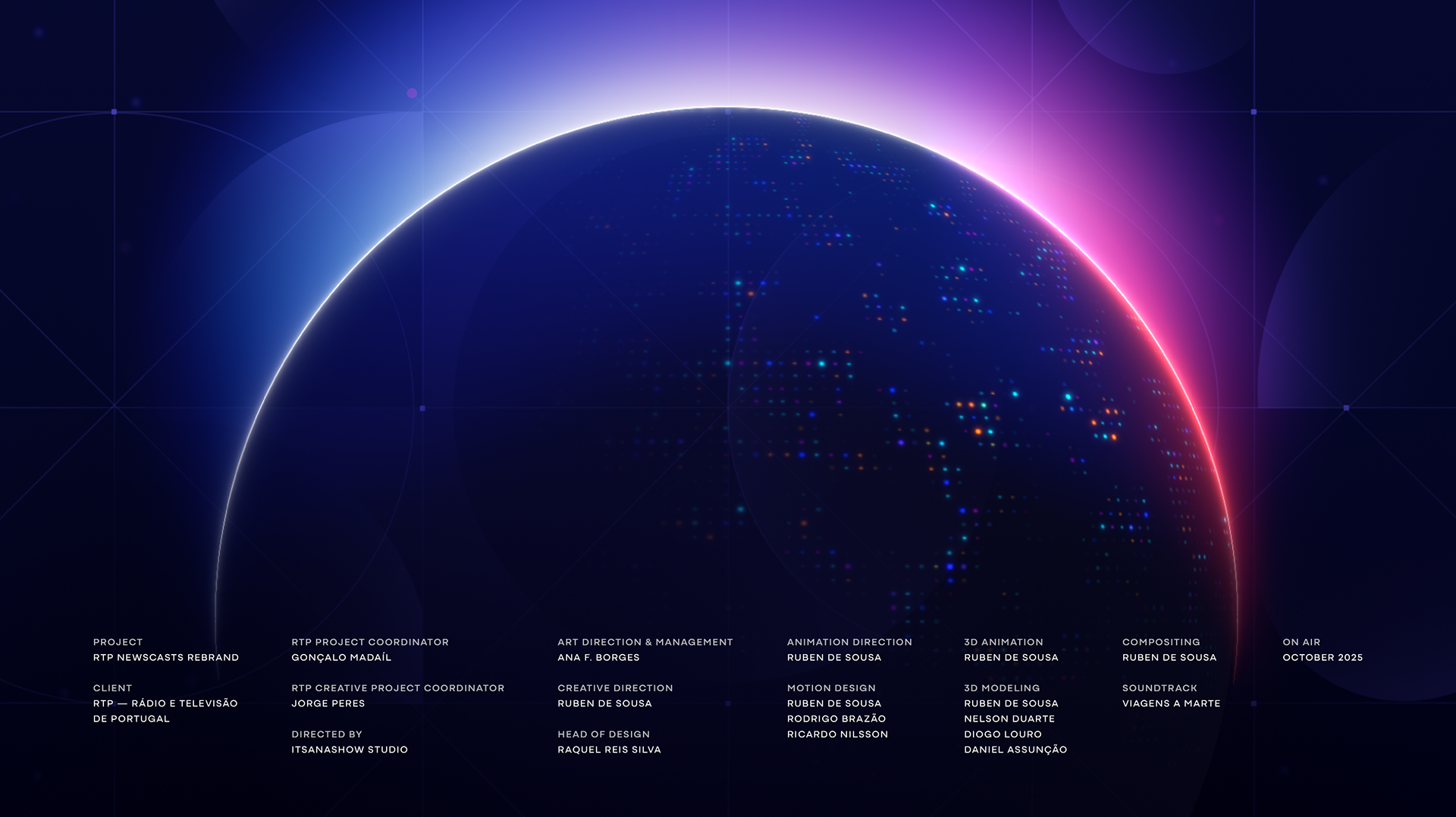
Itsanashow Studio was invited once again by RTP, Portugal’s public broadcaster, to reimagine the visual identity and motion system of its entire news division. From RTP1 and RTP2 to RTP Notícias, RTP África, RTP Madeira, RTP Açores and RTP Internacional, this rebrand goes far beyond a visual refresh. It redefines how trust, clarity and authority are communicated on screen, a crucial challenge in a landscape increasingly shaped by fake news and AI-driven media.
Rooted in the principles of transparency, objectivity and credibility, the new identity reimagines how trust appears and moves on screen. It bridges editorial precision with cinematic motion, creating a design language that is clear, confident and human — elevating the role of public-service journalism through design.
Developed over more than a year and in close collaboration with RTP’s in-house team, the project became part of a broader restructuring, aligning direction, studio set design and on-air presence under a renewed commitment to public service.
Our approach combined broadcast storytelling, editorial systems thinking and UI-driven motion cues to build a future-proof visual language. A unified system where brand, motion and editorial strategy operate as one, strengthening RTP’s news ecosystem across every channel and every format.


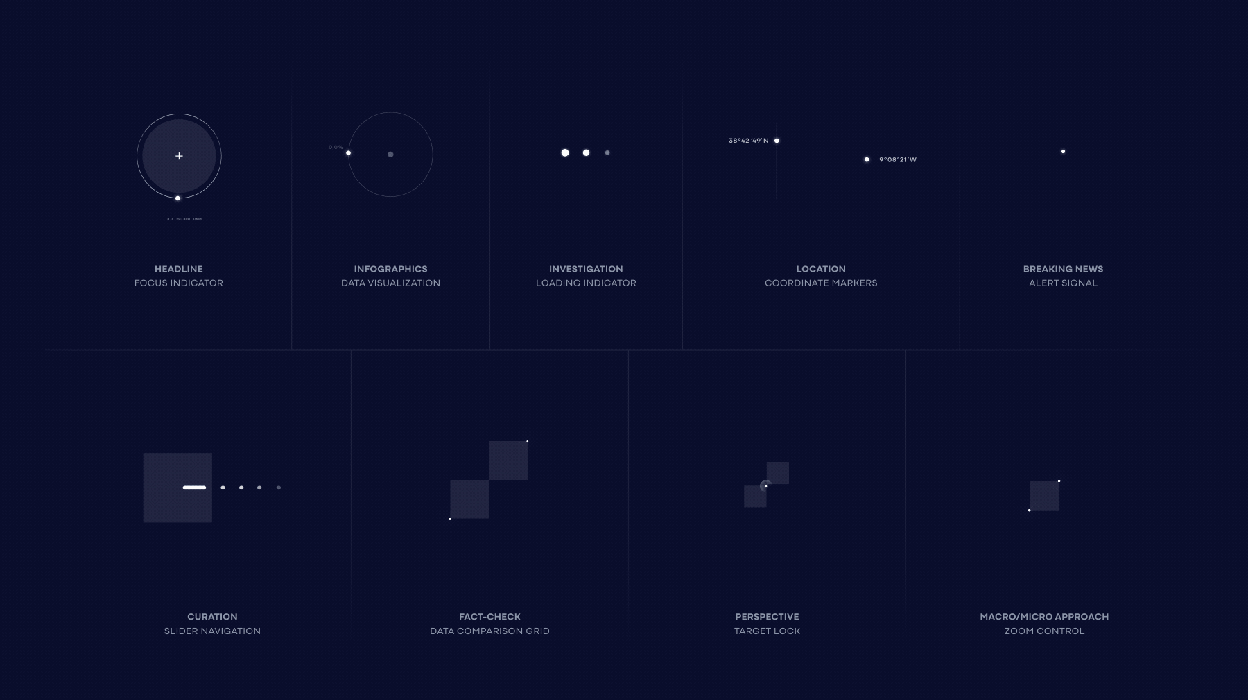
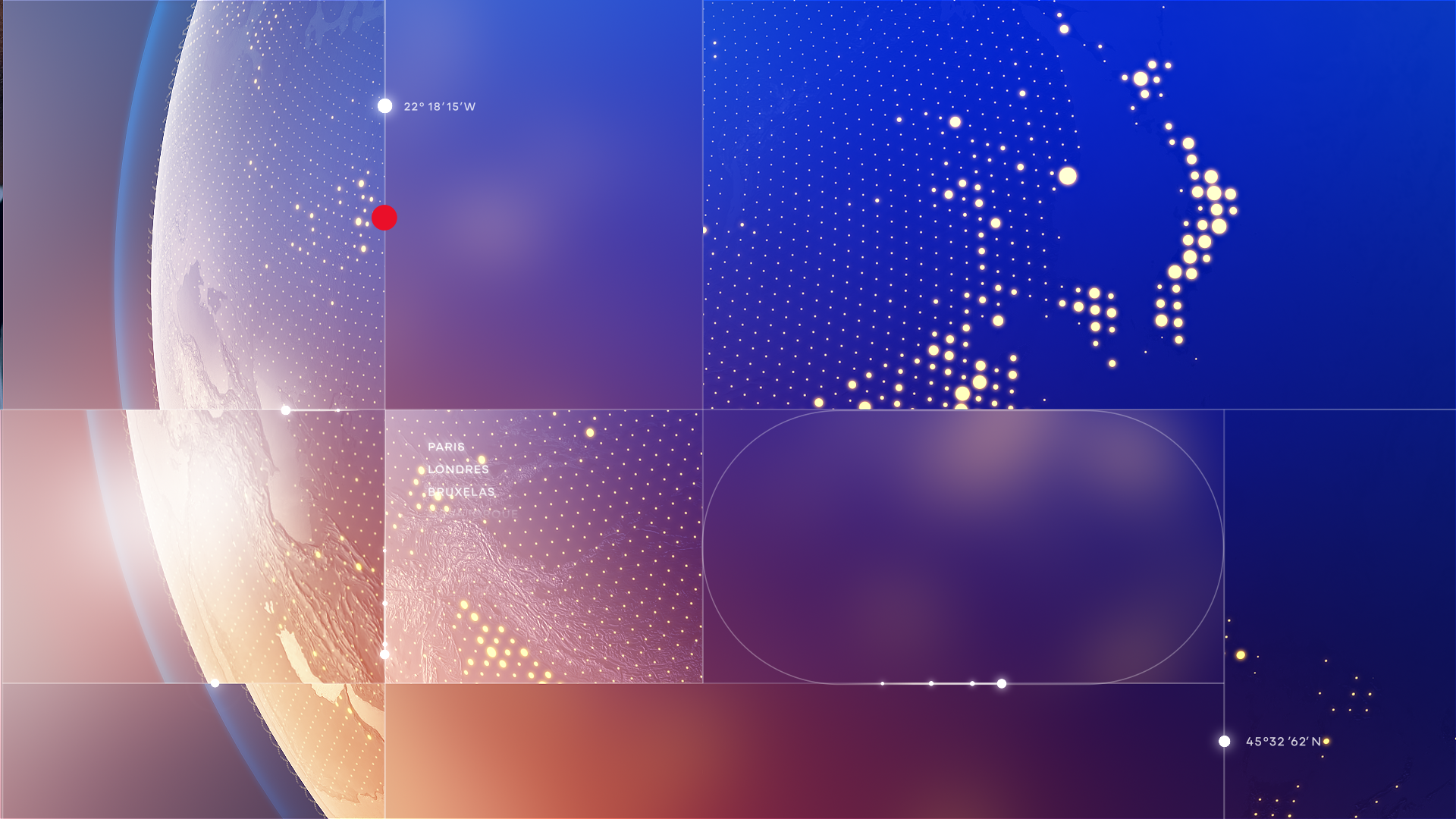
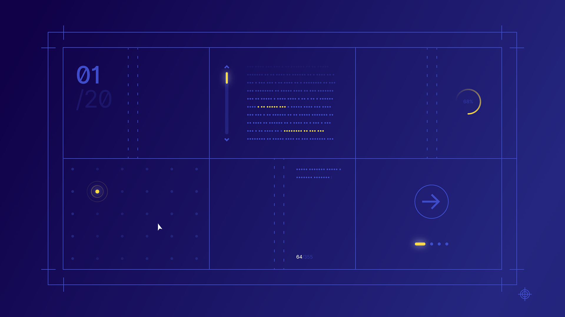
Microanimations
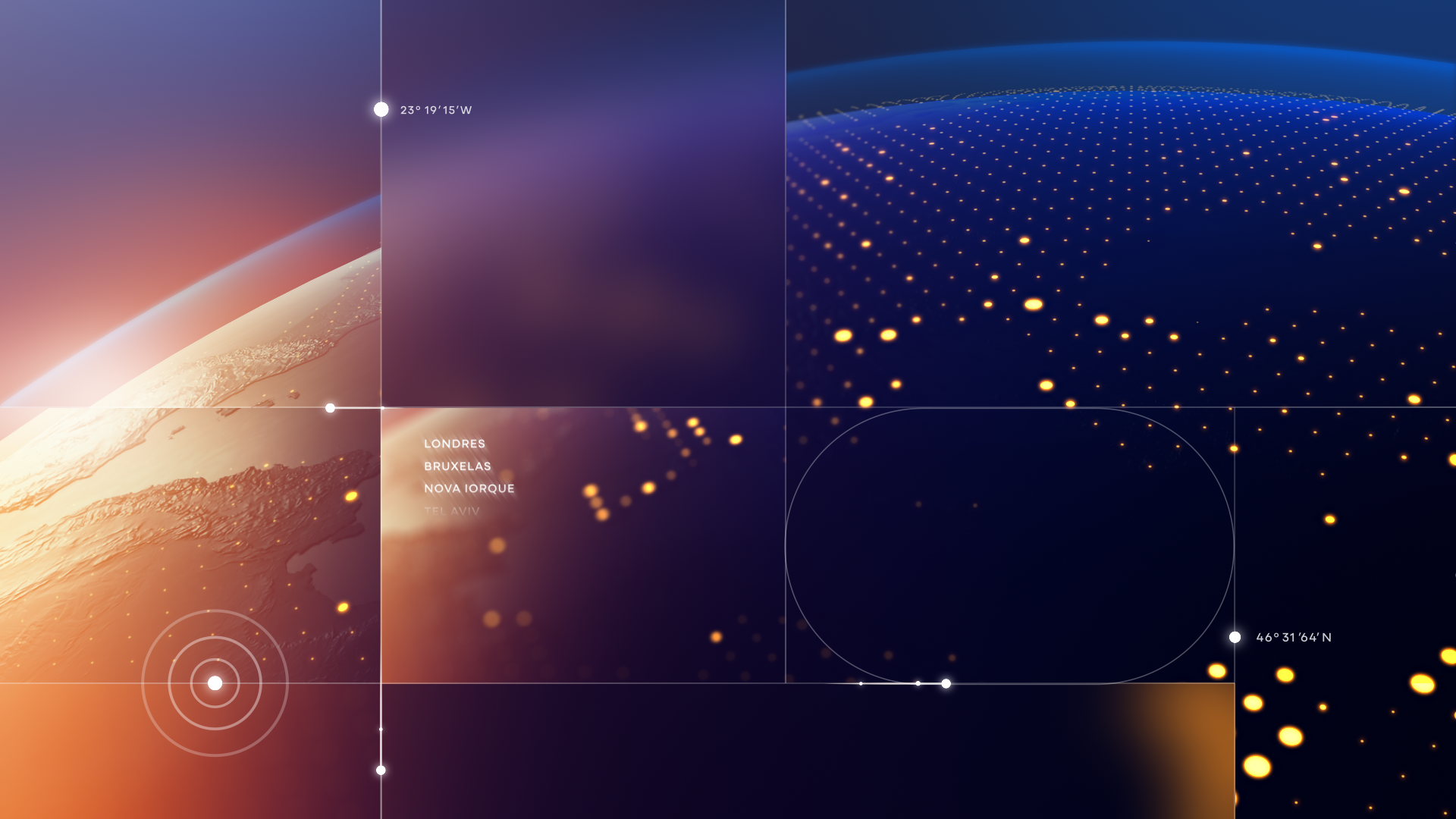
We created a set of microanimations that connect digital UI behaviors with journalistic actions, from headline focus and investigation loaders to coordinate markers and data cues. Each gesture becomes part of a shared, intuitive motion vocabulary that mirrors newsroom workflows and strengthens the overall editorial rhythm.
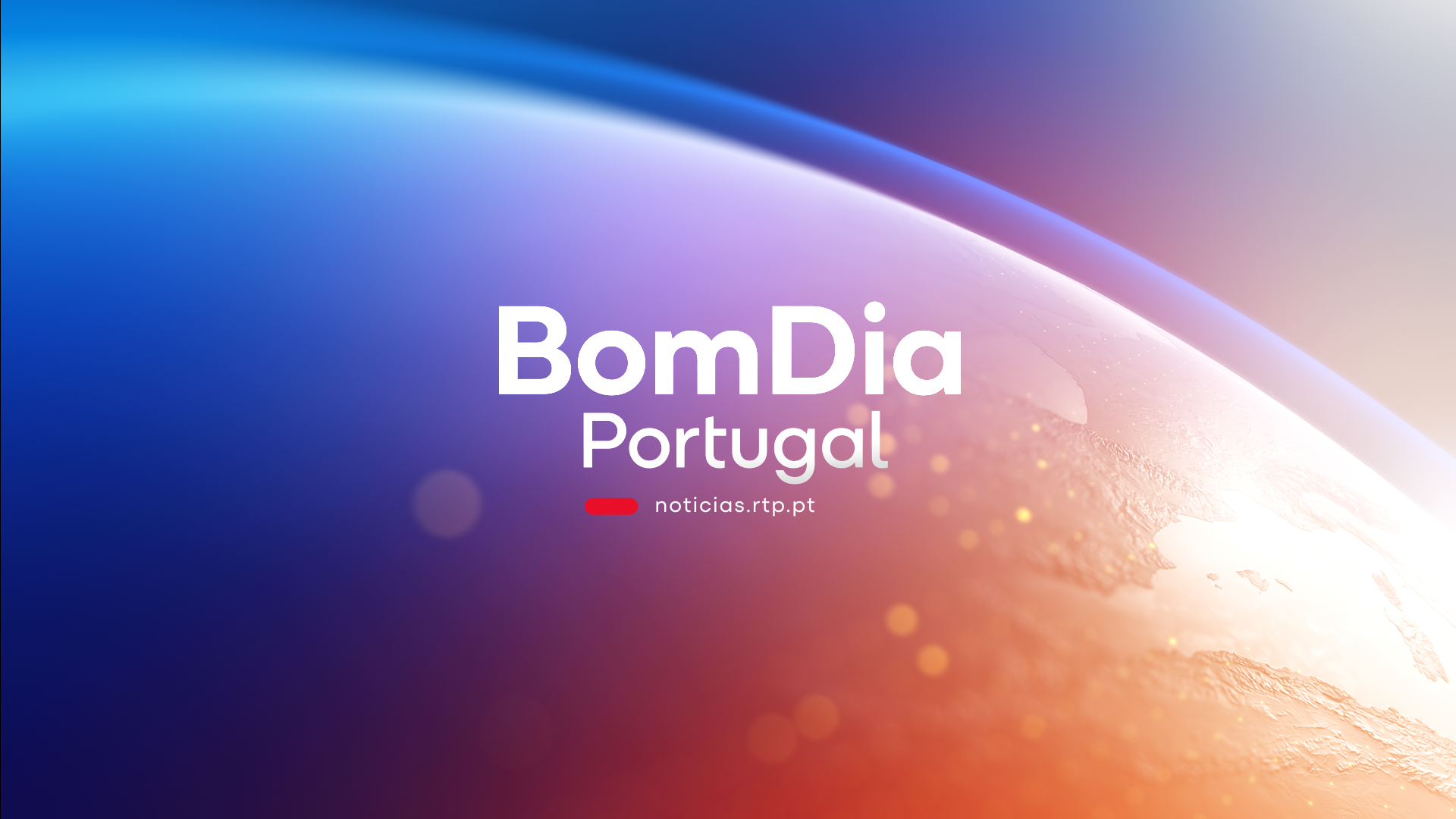
RTP1 & RTP2
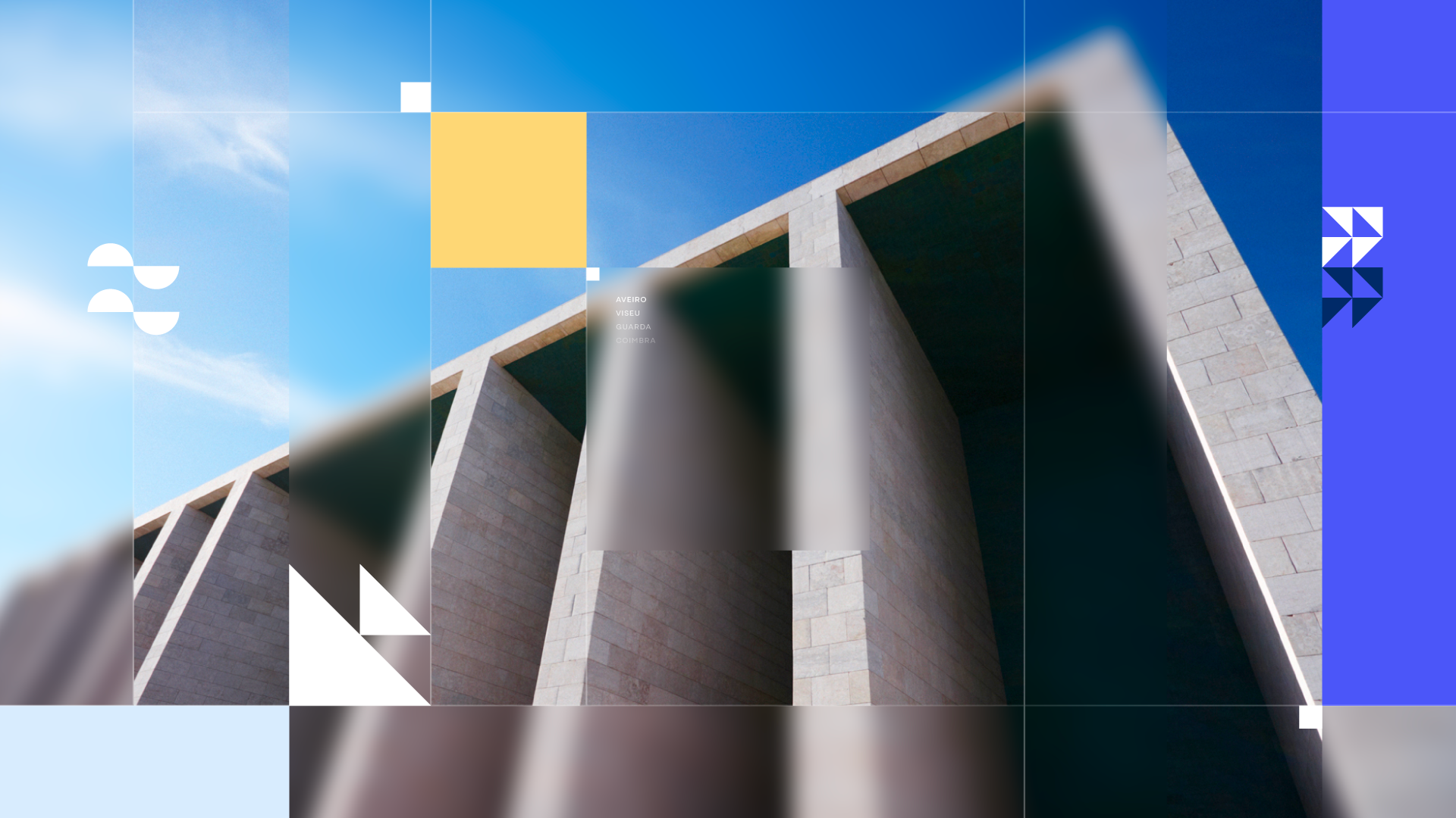
These flagship openers bring real-world footage back to center stage, blending live imagery seamlessly with a responsive motion grid and a cinematic 3D globe. This visual direction reinforces RTP’s historic authority as a national news source. Structured, coherent, and unmistakably RTP, these openers set the tone for the entire family through strong compositions, layered depth, and a clear editorial structure.


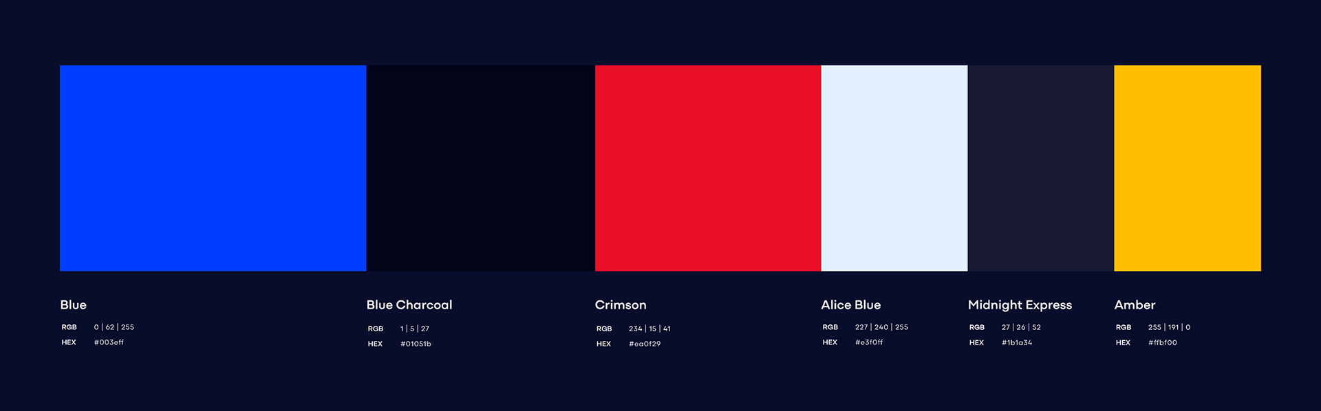
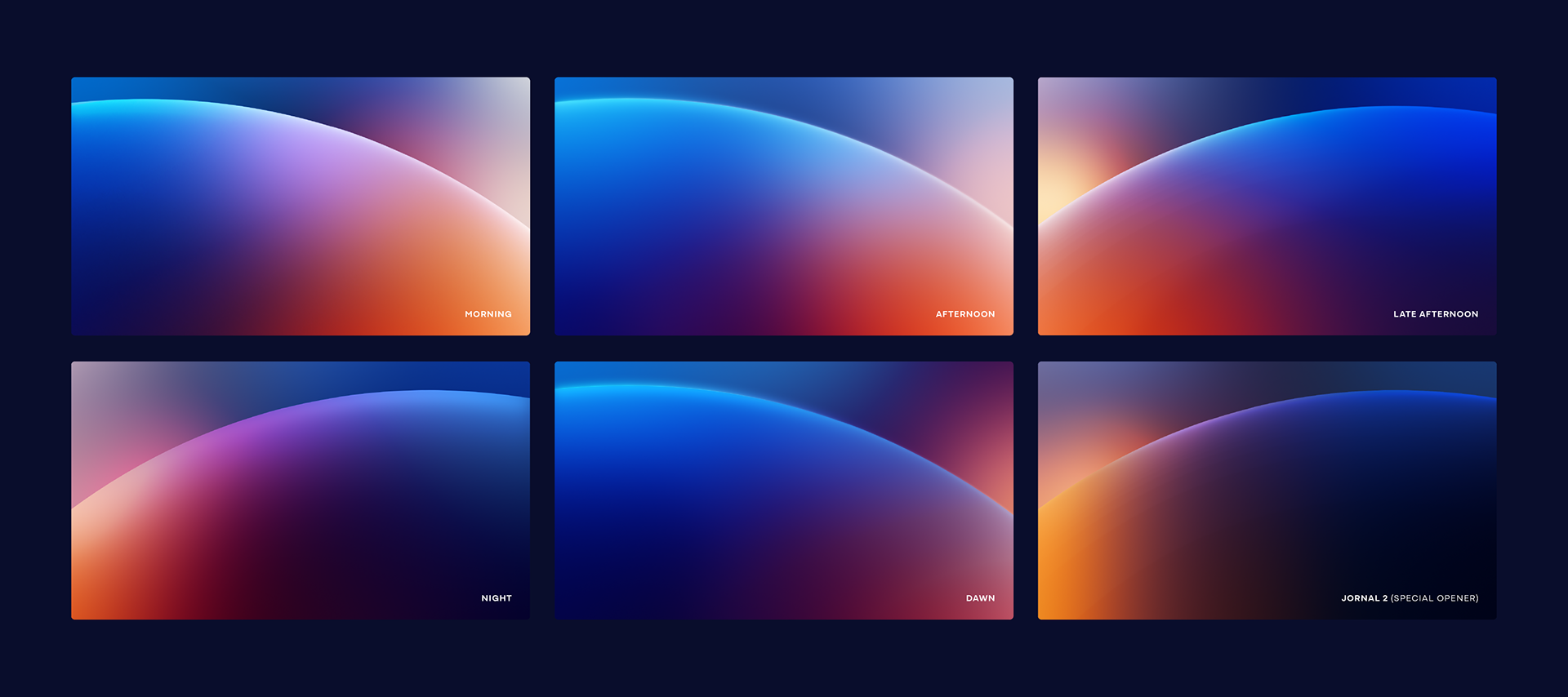
Color System
The color system is built around what we defined as RTP’s core tonal anchors. Strong, bold colors reflecting RTP’s identity (Blue), elegance, and authority create the foundation for a broader gradient palette. This allowed us to design a system that evolves naturally throughout the day: mornings use soft gradients and gentle light, afternoons introduce warmer hues and higher contrast, and evenings shift into deep, cinematic tones and nocturnal blues. A color system designed to move with the viewer, the day, and the news cycle itself.
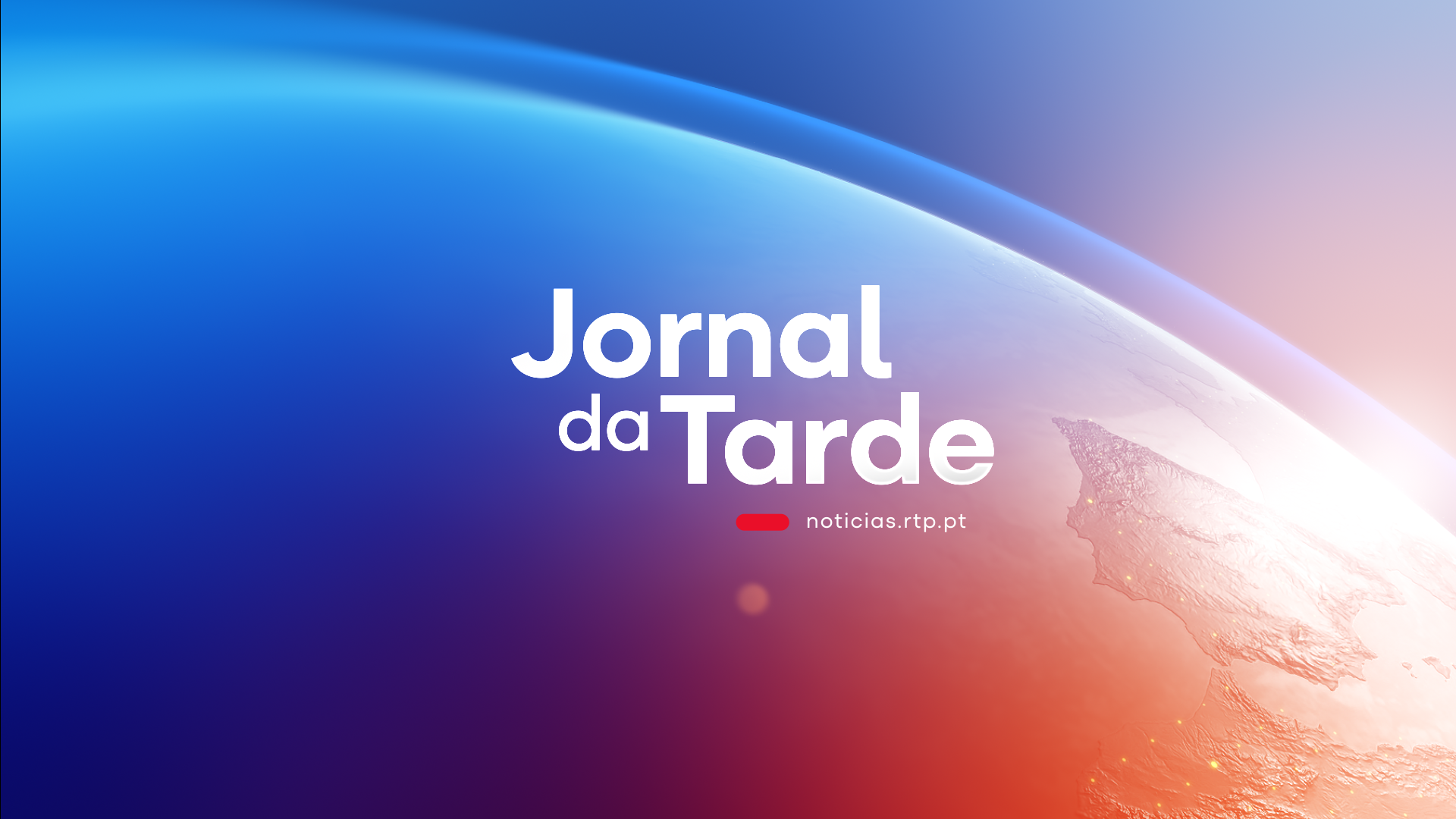
RTP Notícias
Designed for hourly bulletins, these openers prioritize a brief and direct introduction that marks the start of each new hour with the latest updates. We developed a continuous 3D globe sequence paired with a fully responsive editorial grid and a color gradient that shifts throughout the day, creating a unified visual rhythm across 24 hours of news.


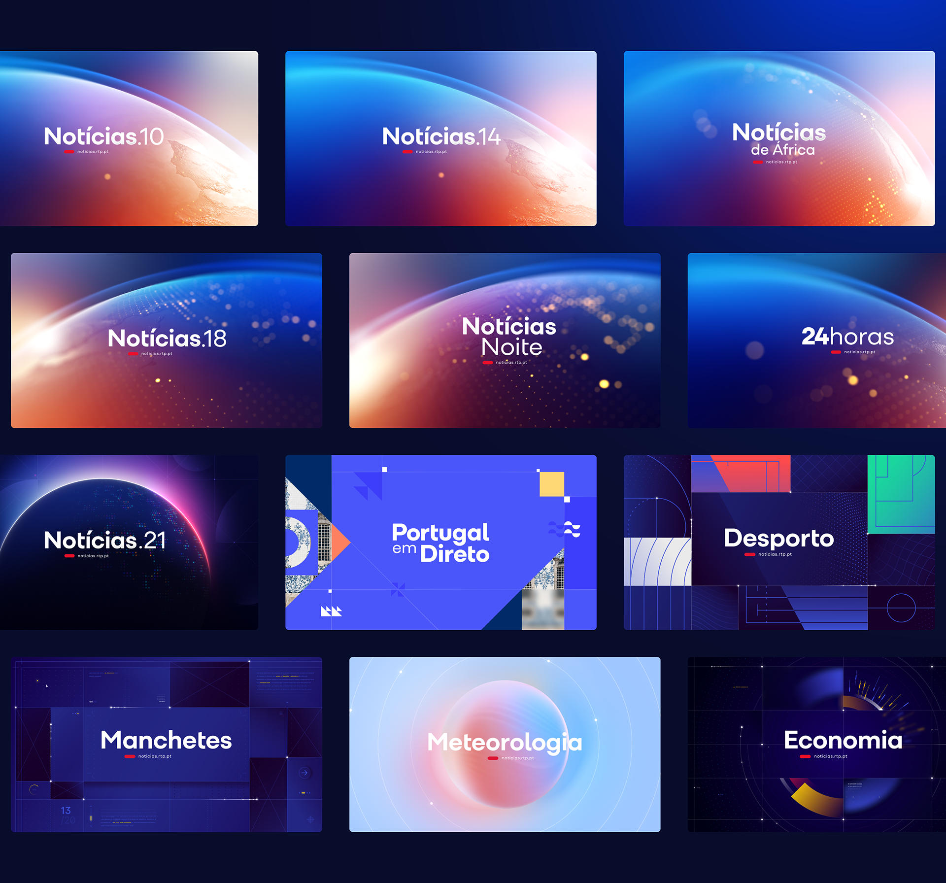
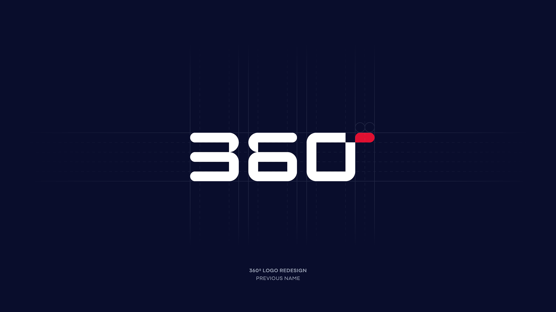
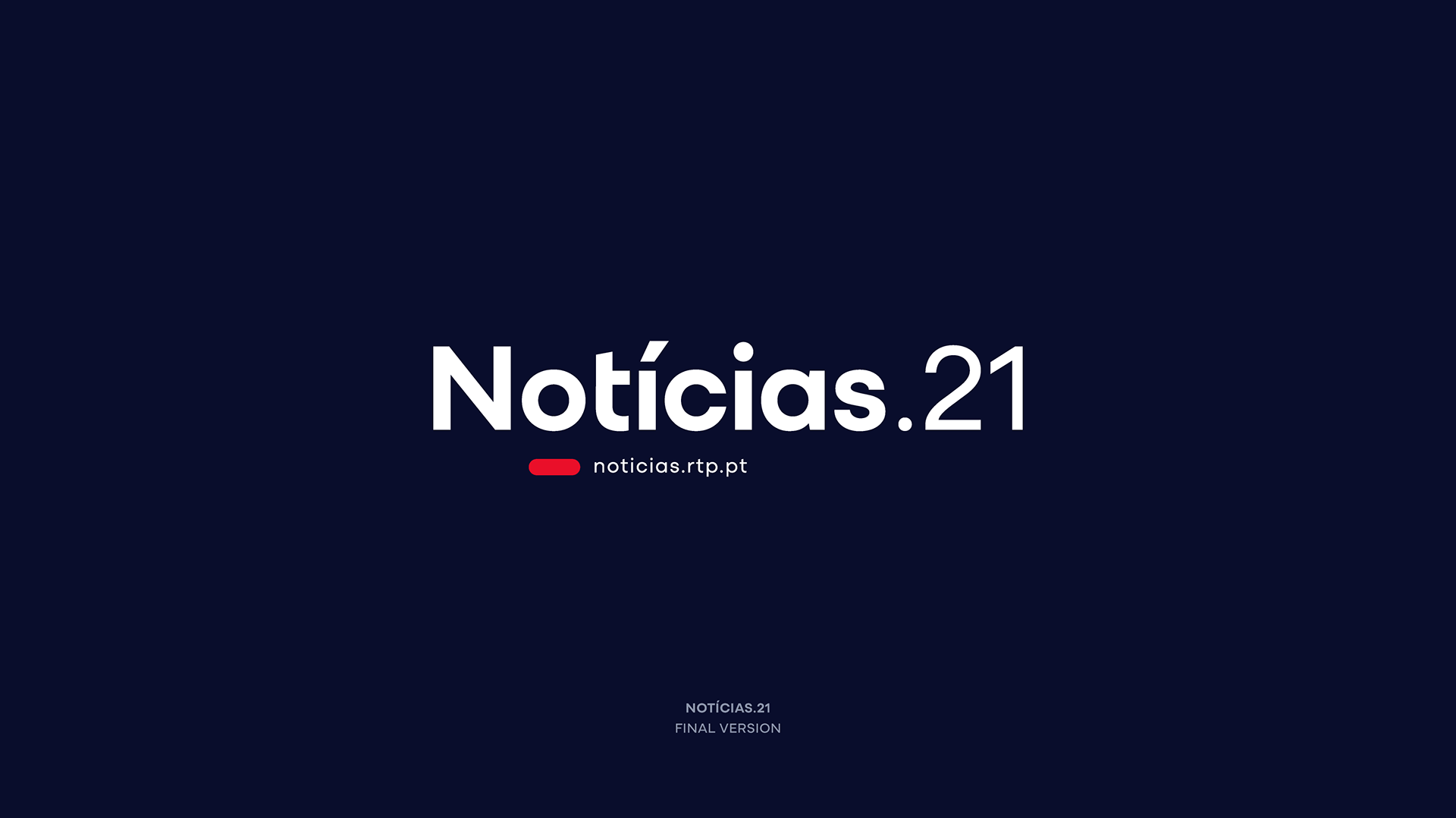
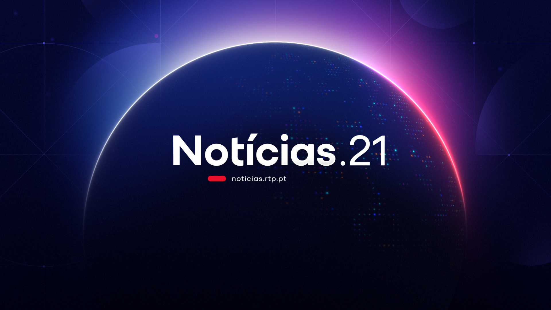
Notícias.21 (formerly 360)
Minimal, digital, and distinctly nocturnal, this opener builds an intimate yet analytical tone for late-night conversations. A single beam of light cuts through the void, revealing a modular, data-driven grid in constant transformation, echoing the feeling of real-time information analysis. Deep nocturnal tones reinforce a mood that is focused, modern, and unmistakably prime-time.

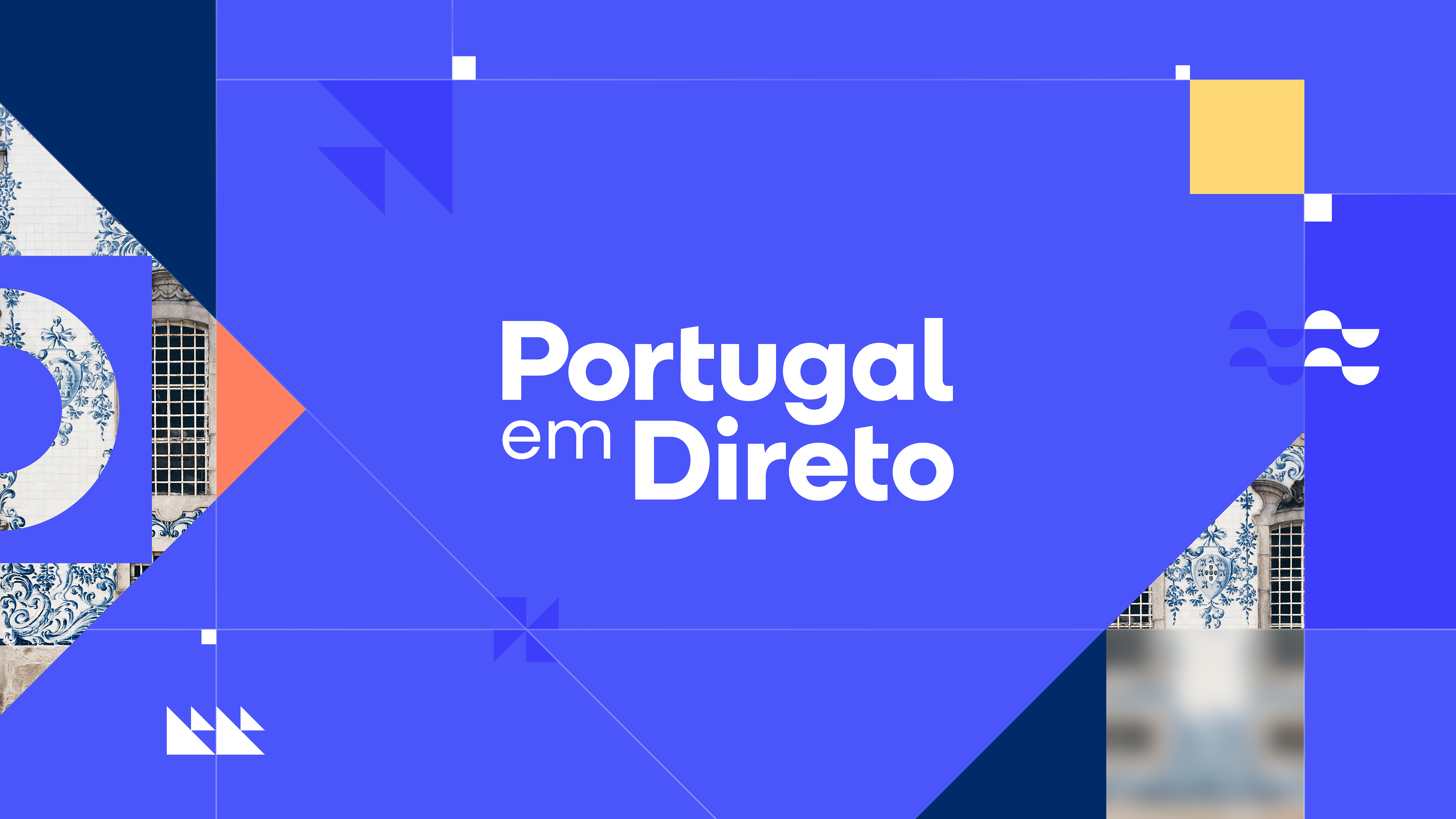
Portugal em Direto
A human, culturally rich opener inspired by Portugal’s textures, patterns, and materials. Azulejo motifs, warm colors, and footage ranging from tourism to industry, paired with dynamic transitions, honor regional stories while keeping them connected to the broader RTP identity. Local in spirit, national in structure.

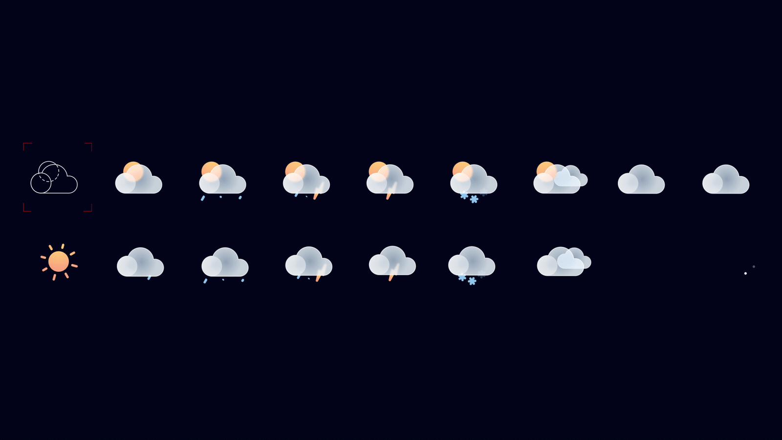
Meteorologia
A translucent, glass-like sphere where light and color shift gently. Wind lines form inside it, suggesting an environment in constant transformation. A multi-layered visual grid defines the world of meteorology.
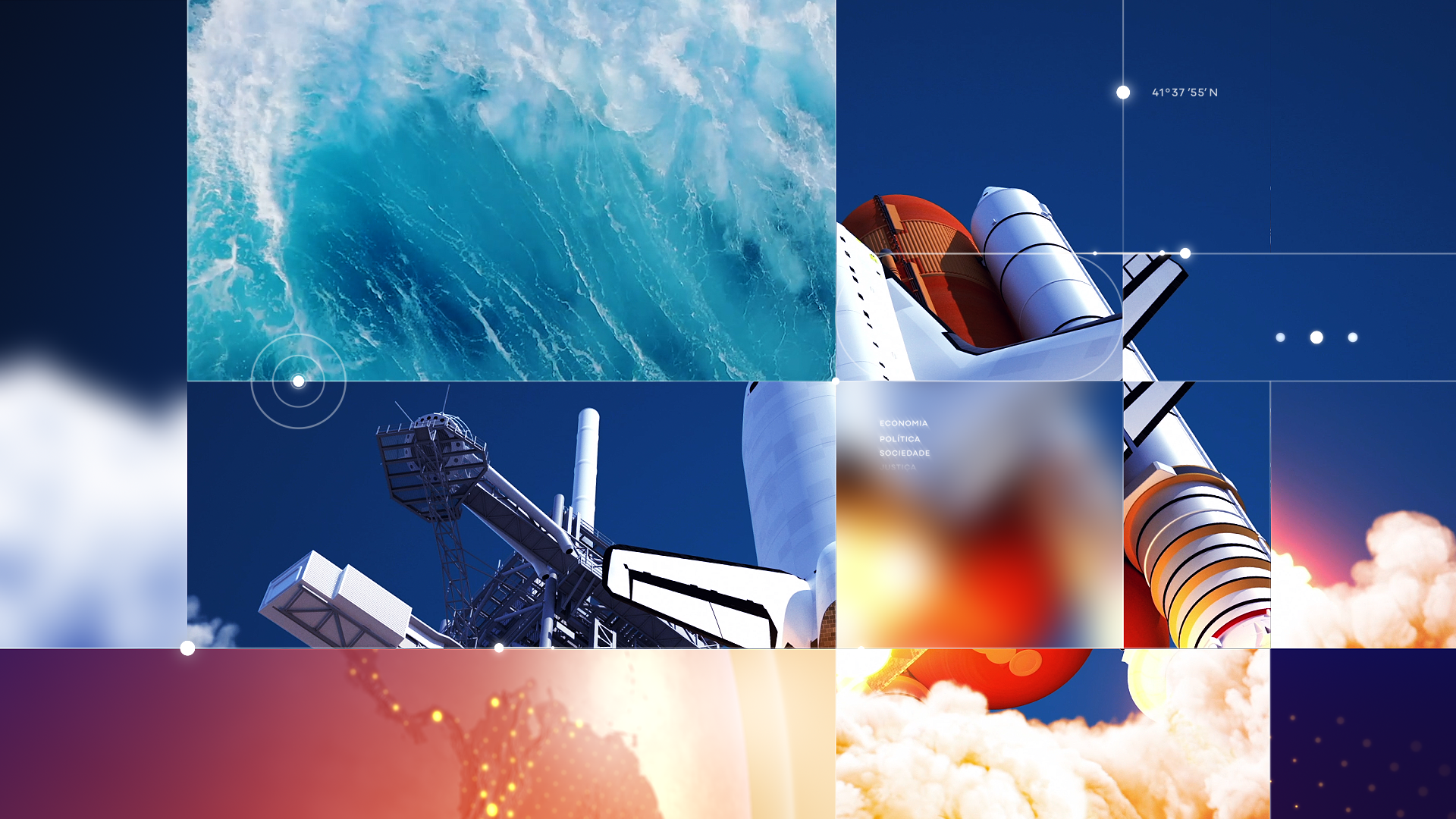
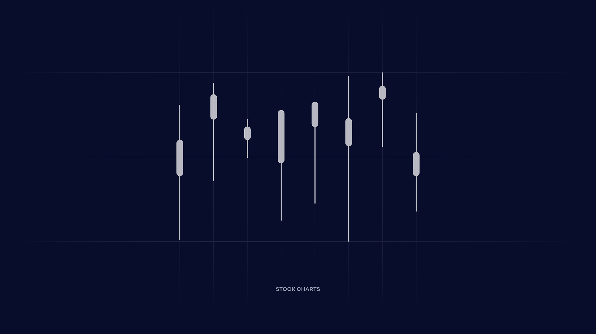
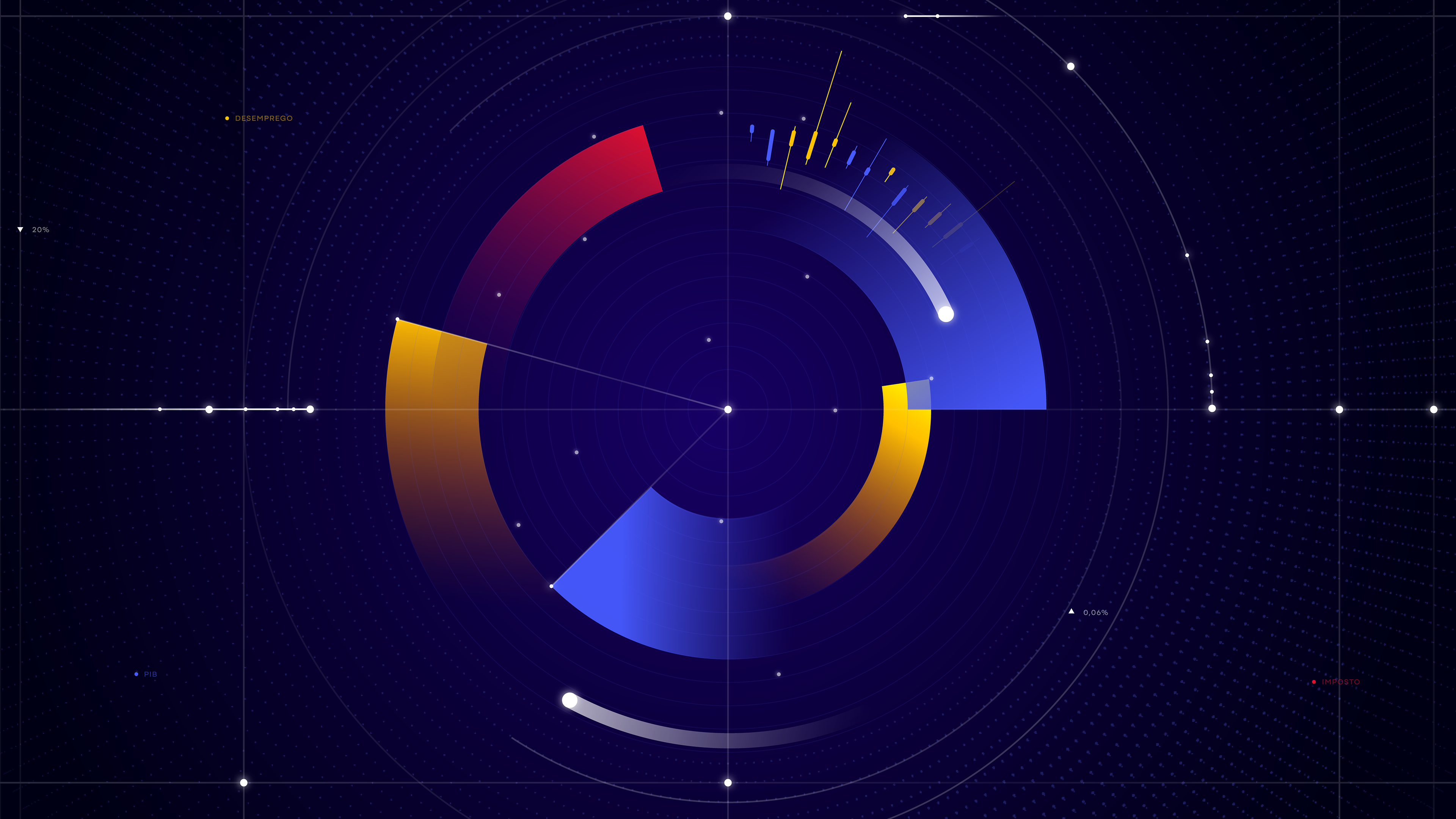
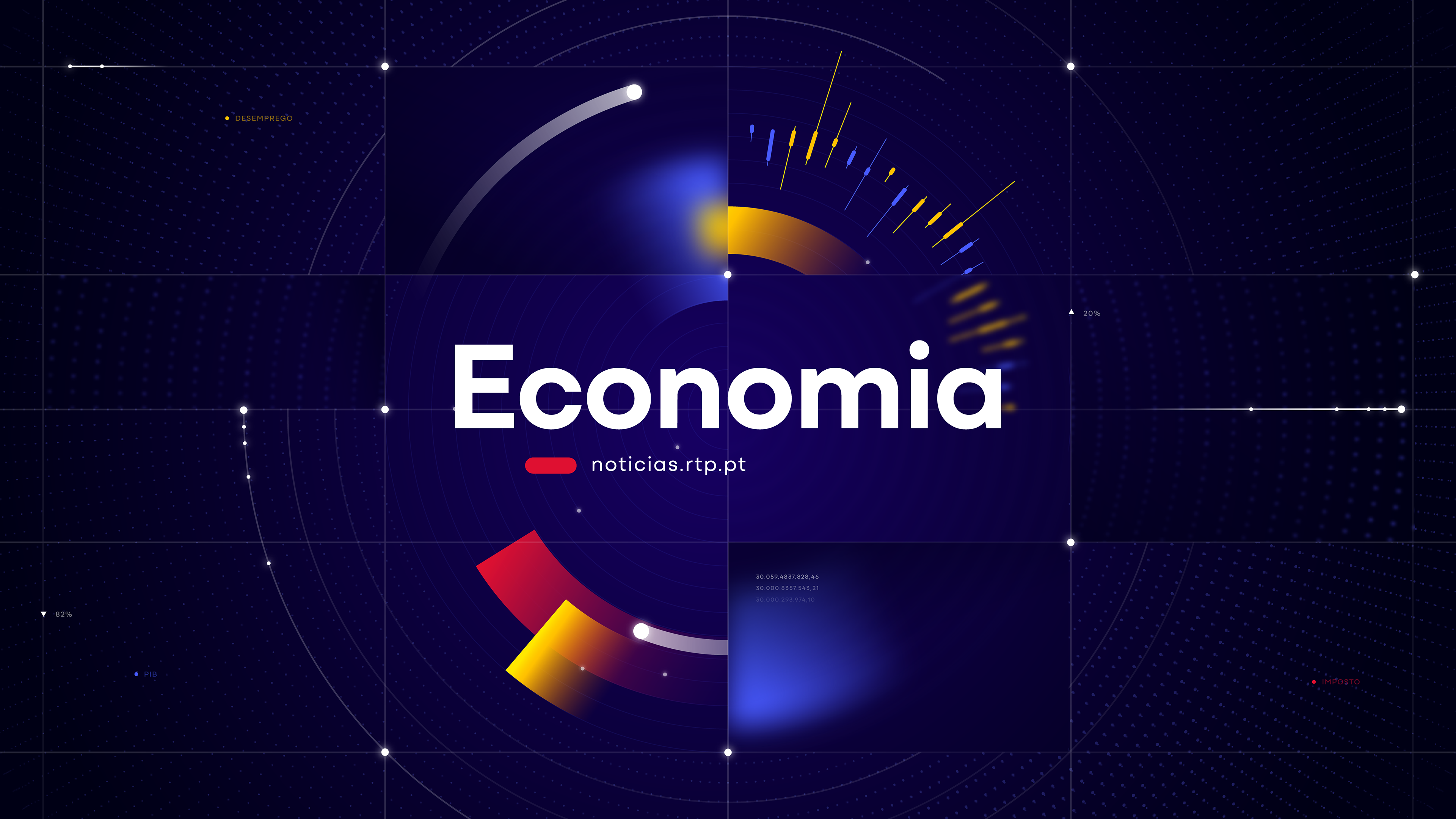
Economia
A bold, data-driven visual identity inspired by graphs, stock movements, and financial metrics, reinforced by intentional and meaningful use of color.
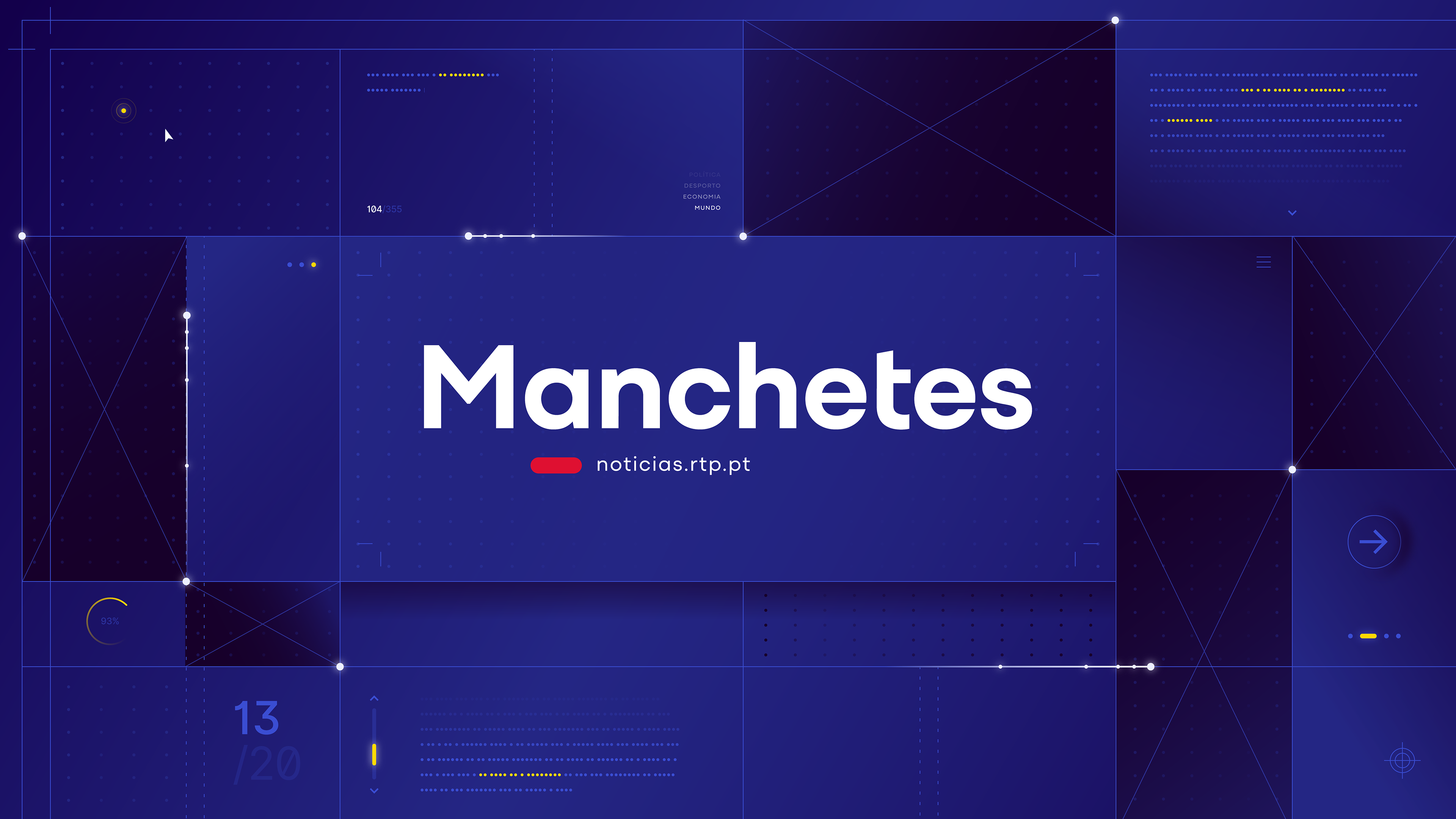
Manchetes
This opener translates the structure of printed journalism into a modern broadcast framework. Typography, layout blocks, and blueprint-inspired compositions create a clean and editorial environment where information feels curated, organized, and authoritative. A minimalist tribute to the foundations of news design.

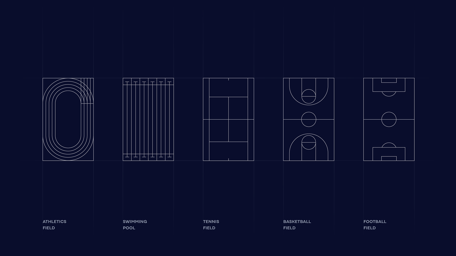
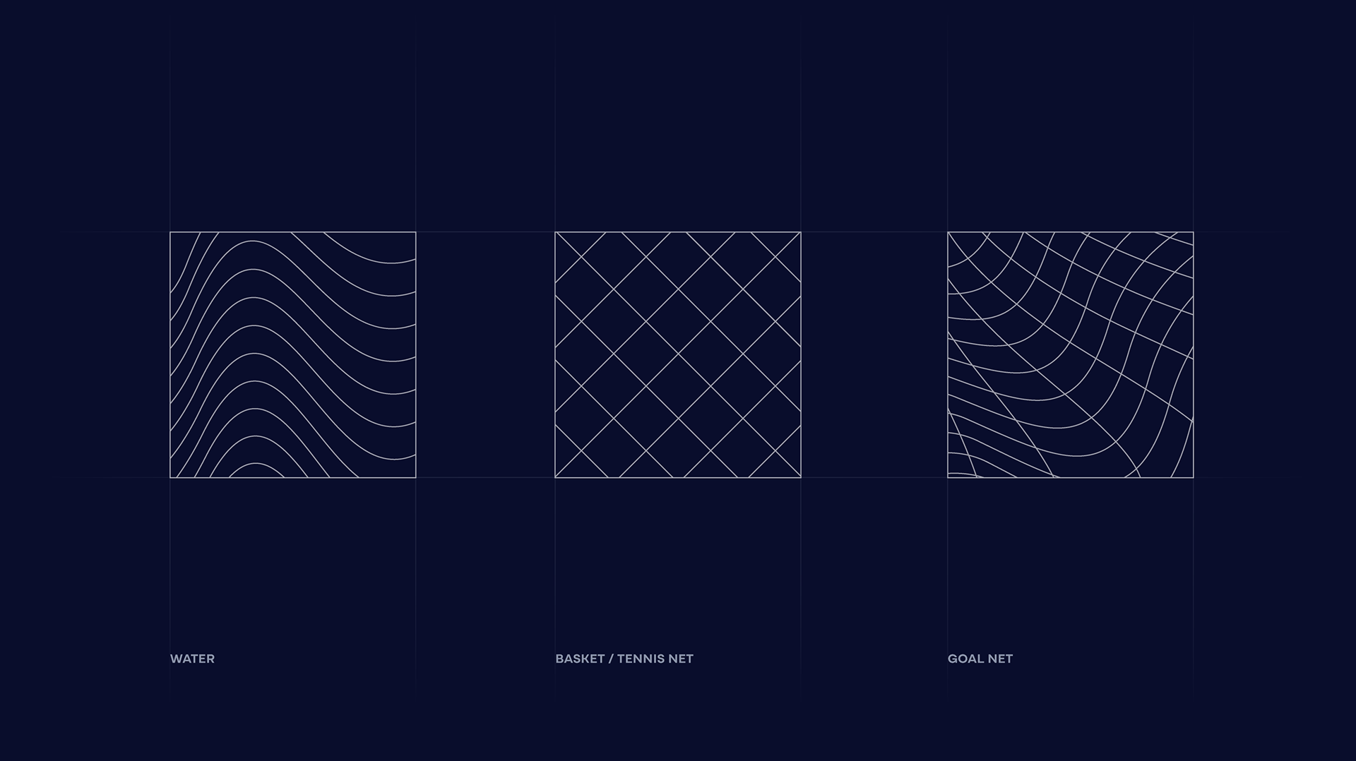
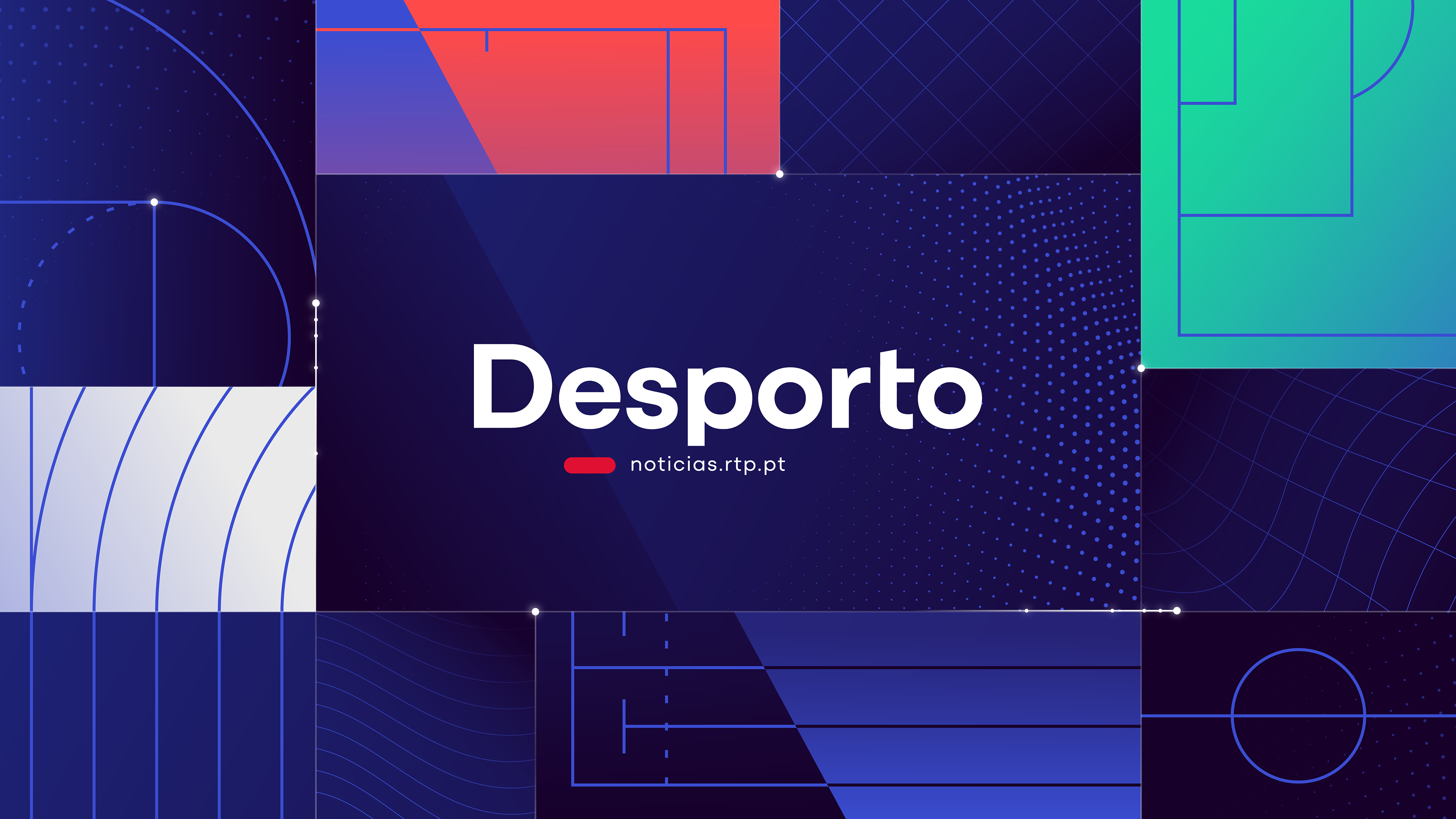
Desporto
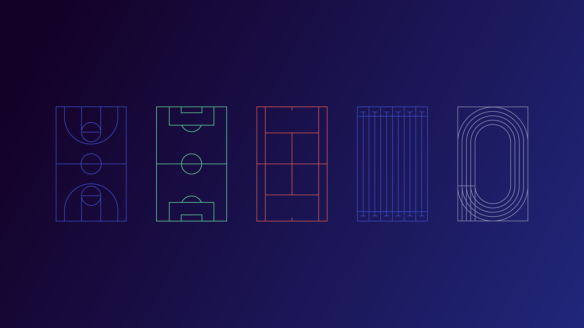
Energetic, vibrant, and dynamic, this opener uses minimal sports-inspired patterns and a responsive grid referencing fields, courts, and competitive movement.
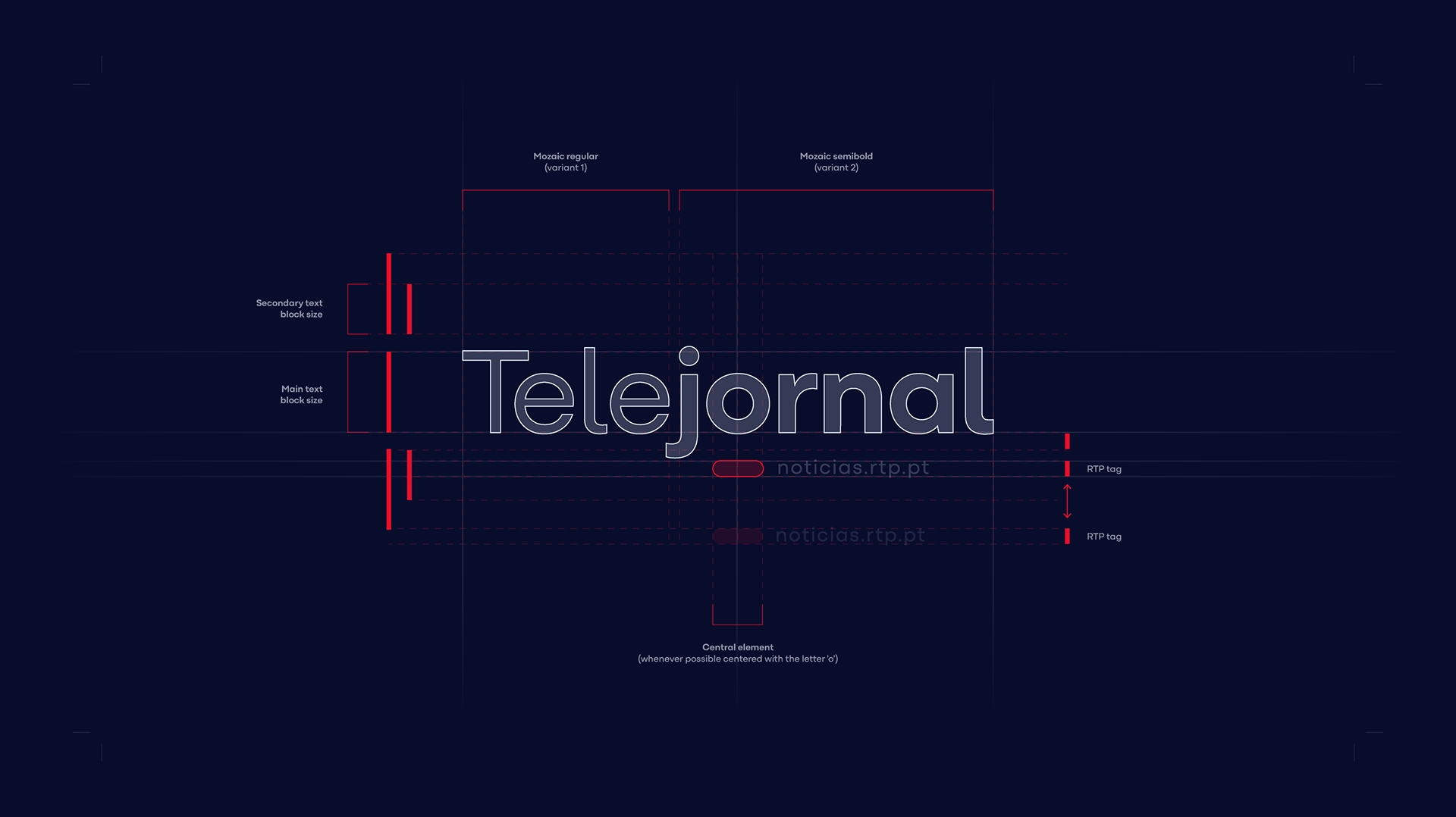
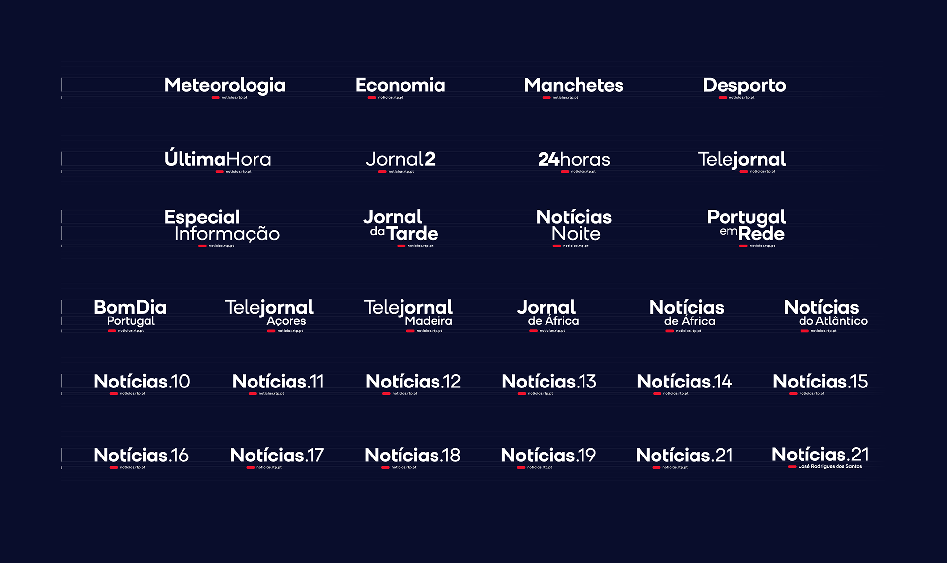
Logo System
The Red Toggle, the Signature of the Entire Identity
Inspired by the iconic broadcast lines of RTP’s historic logo, the Red Toggle acts as the maestro of the identity system. It drives transitions, shapes the rhythm of the motion, and becomes the defining signature that unifies every program logo, tying the entire news family together with one clear and recognizable gesture.
To support this system, we selected Mozaic as the core typeface for all program logos. Its friendly yet refined geometry offered the right balance between authority and accessibility, aligning perfectly with RTP’s positioning as a trusted public broadcaster with a contemporary voice. We refined the type to ensure it met the aesthetic and functional needs of a multi-program ecosystem, from readability to compositional harmony.