Redefining Luxury Real Estate Branding
Houseling is a luxury real estate agency with a clear point of view: success in this market is built on distinction, tailored advice, and genuine client relationships, not on cold, aggressive sales tactics. Itsanashow Studio was commissioned to develop a complete brand identity that reflected this philosophy from the ground up.
THE CHALLENGE
The luxury real estate sector tends toward predictable visual territory: dark palettes, serif typography, and a certain corporate coldness. Houseling wanted none of that. The brief called for an identity that felt elegant and bold at the same time, one that communicated expertise and warmth in equal measure.
THE SOLUTION
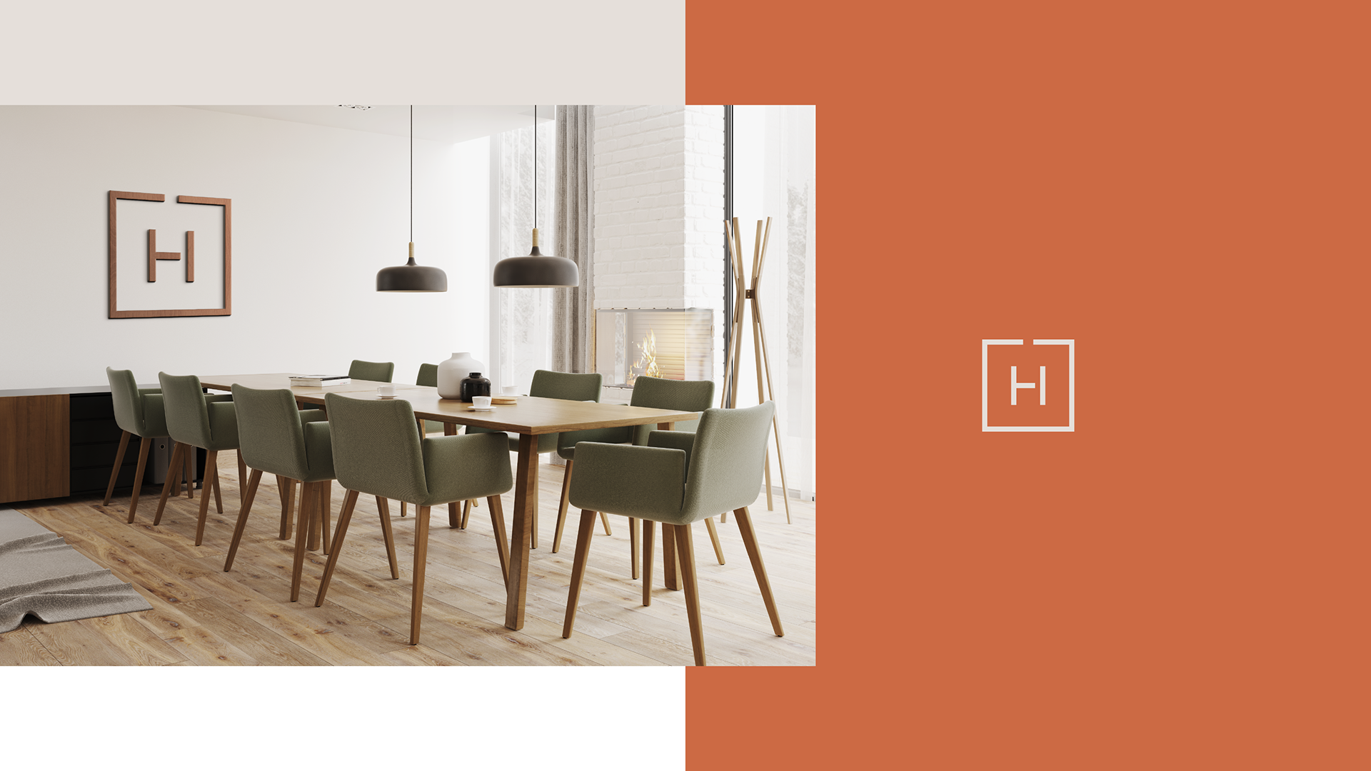
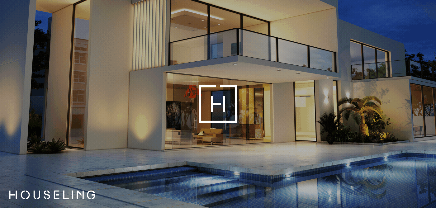
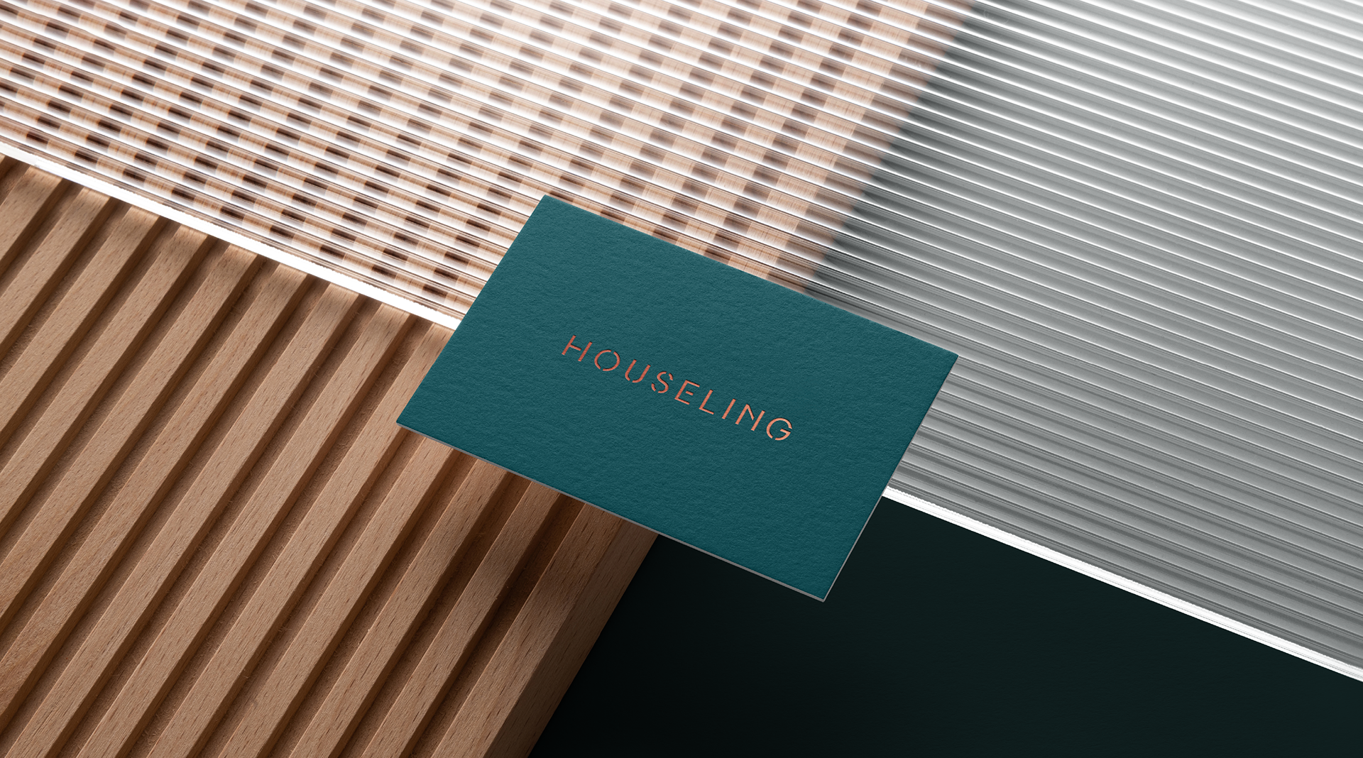
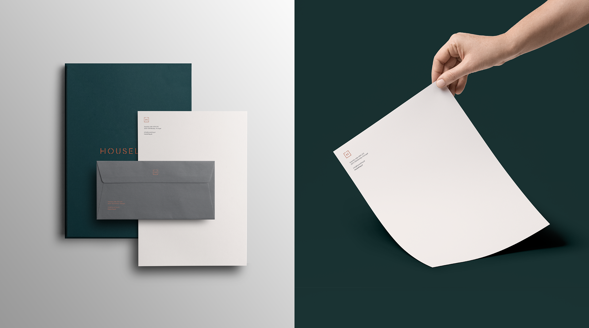
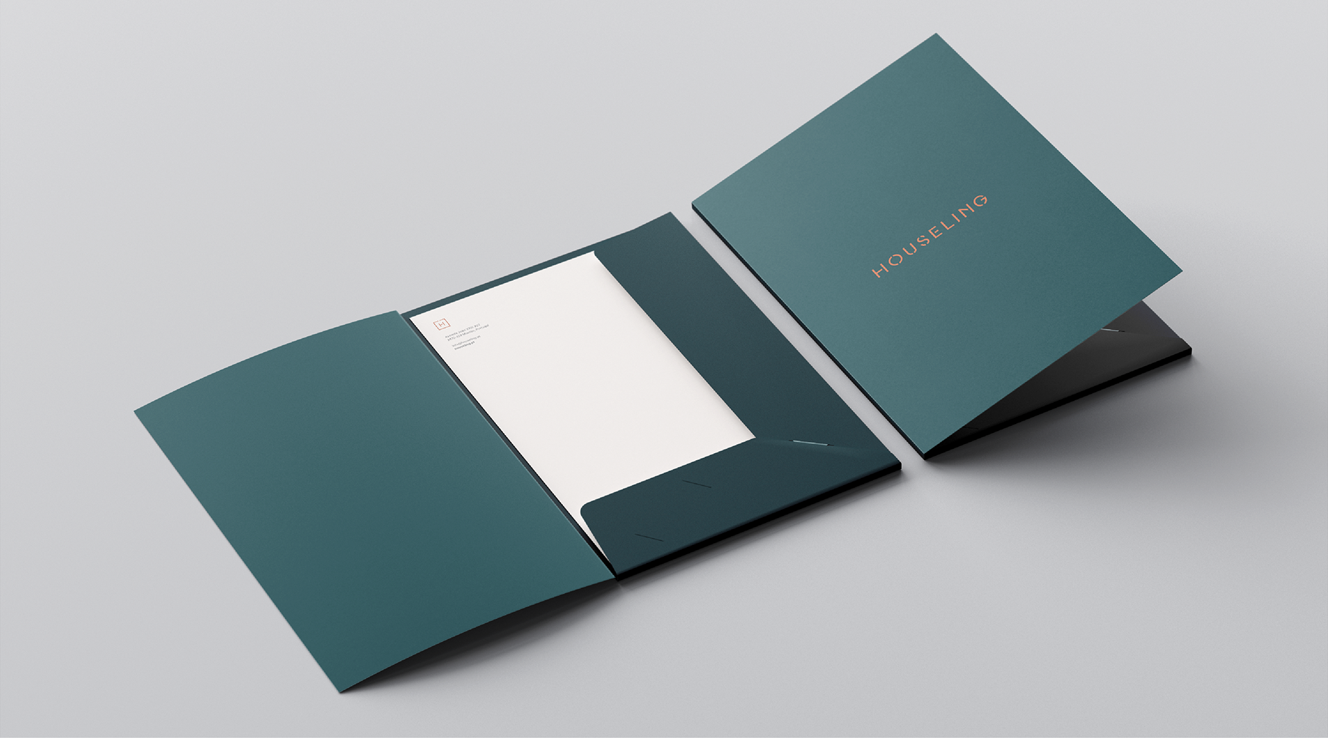
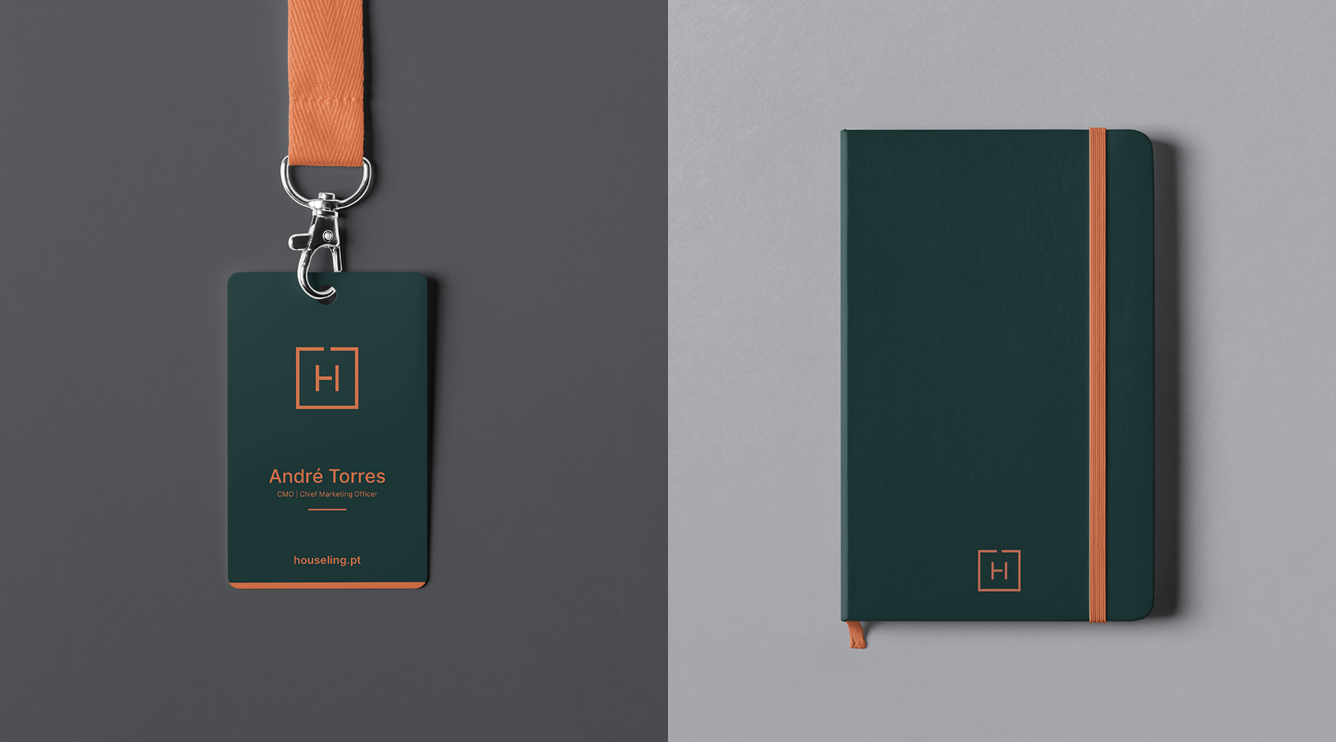
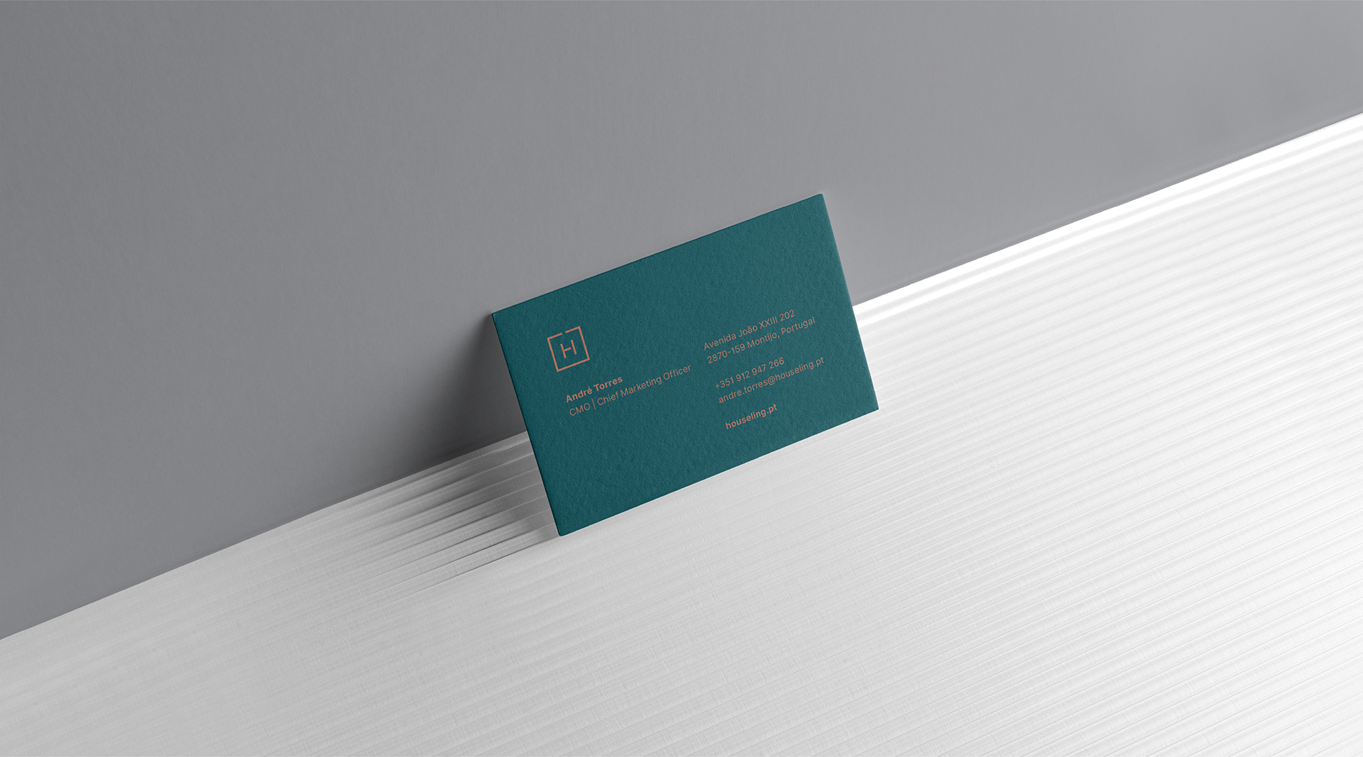
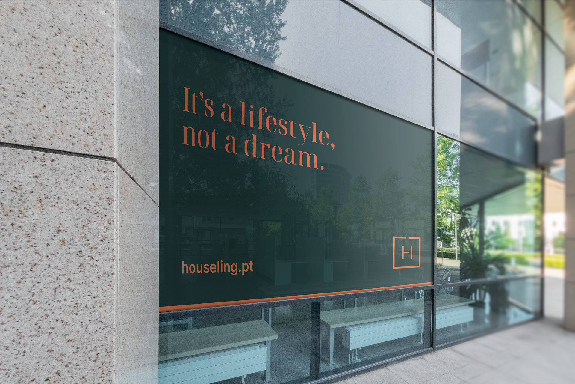
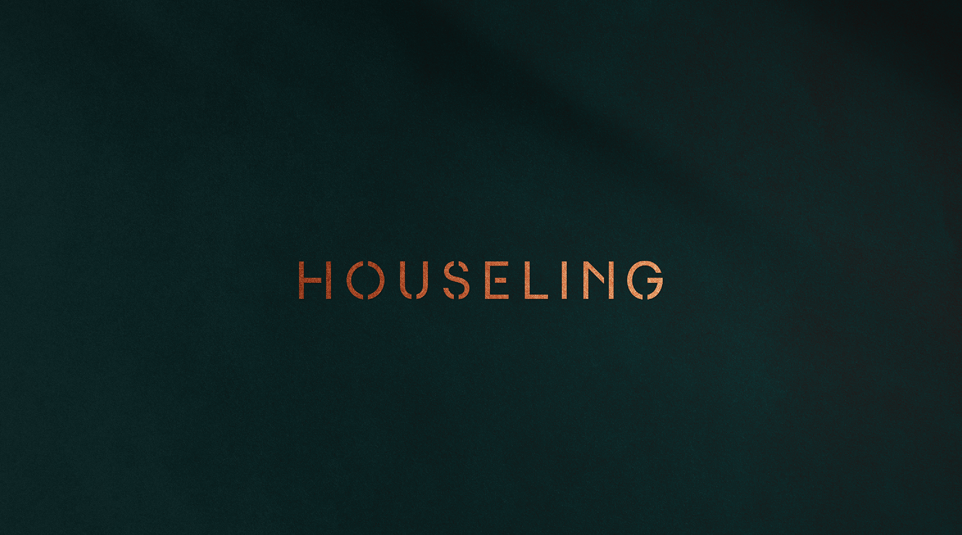
The logo concept was drawn directly from architecture. Taking inspiration from the floor plan of a house, we used the structural lines of a room as the foundation for the logo symbol, extending the same geometric logic into the lettering that forms the brand name. The result is a mark that is minimal, precise, and unmistakably rooted in its industry, without ever feeling generic.
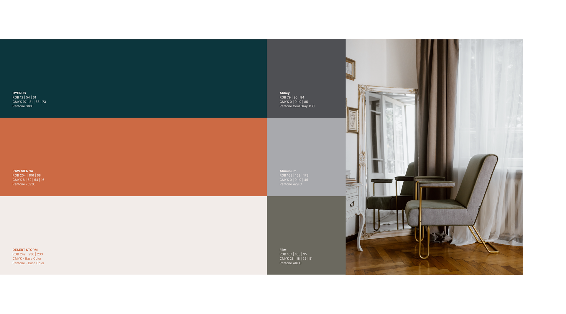
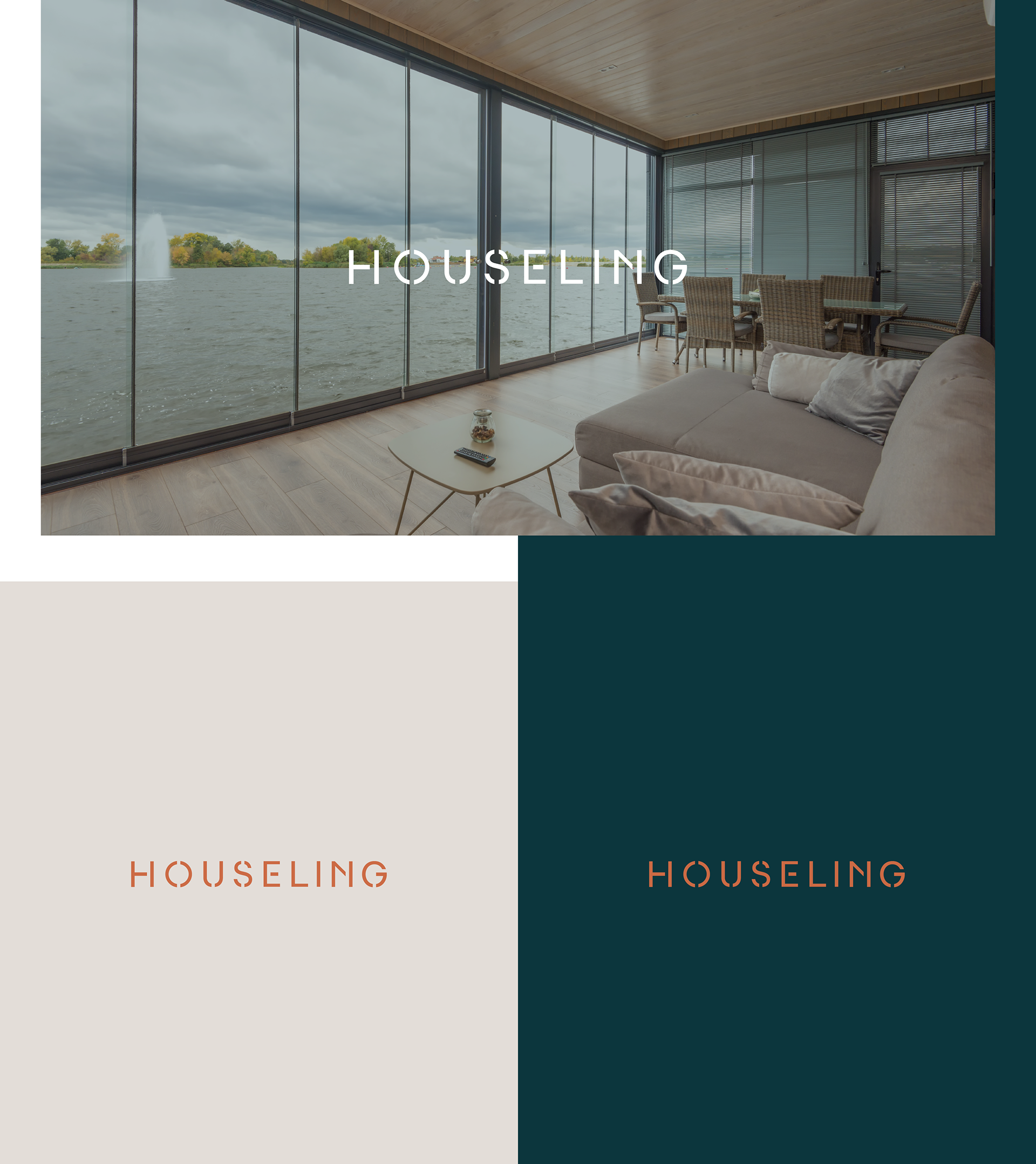
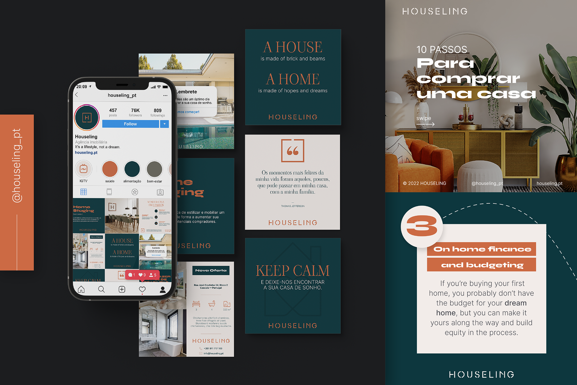
The color palette was chosen to reflect the brand's dual character: a classic, sophisticated green paired with a vibrant, bold orange. Elegant and unexpected in equal measure. The full identity system extends across collateral and social media, maintaining the same balance of restraint and confidence throughout.