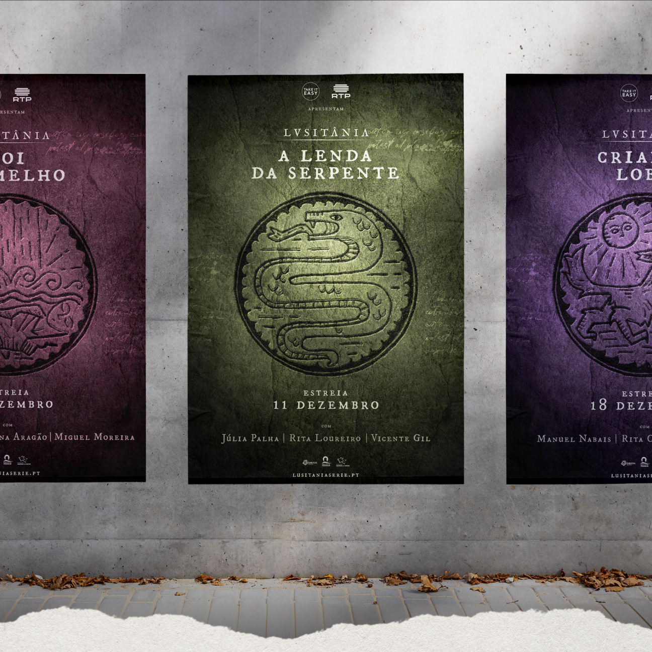
Designing Clarity for Live News
RTP (Rádio e Televisão de Portugal) is Portugal's public service broadcasting organization, operating four national television channels, three national radio stations, and several satellite and cable offerings. Itsanashow Studio was commissioned to develop a comprehensive new visual identity for every newscast program across the network.
THE CHALLENGE
The new identity needed to reflect RTP's evolving editorial strategy: forward-looking, dynamic, and youthful, while streamlining operators' live production workflows and maintaining full visual coherence across all broadcast formats and platforms.
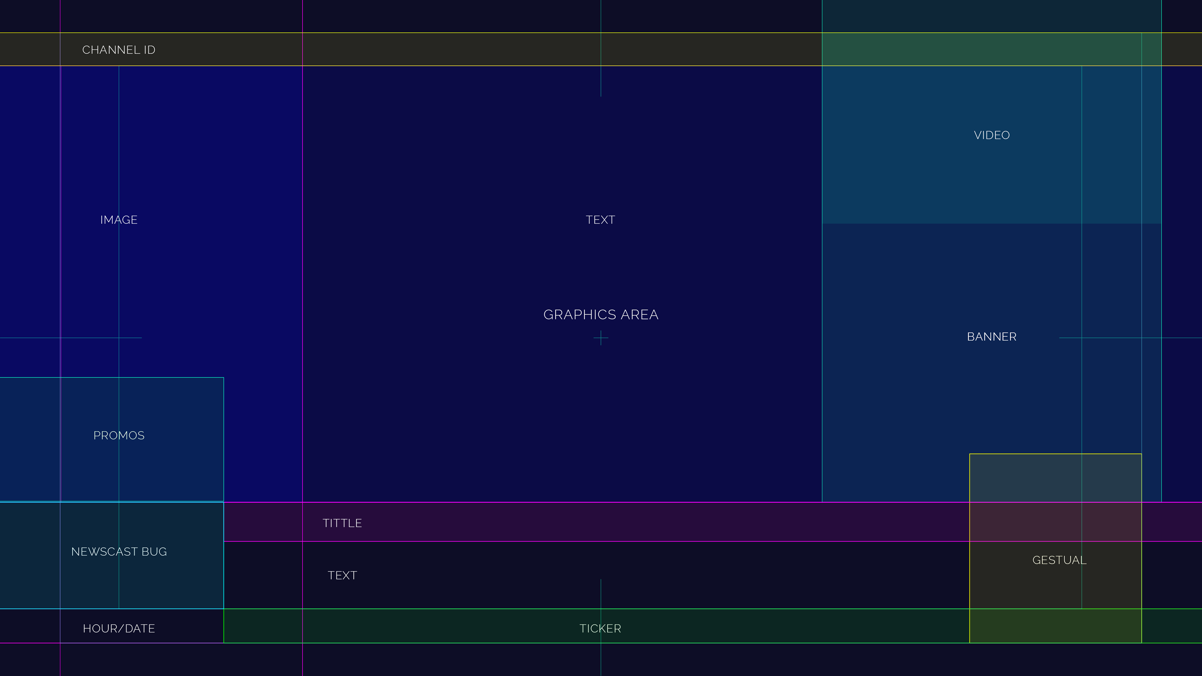
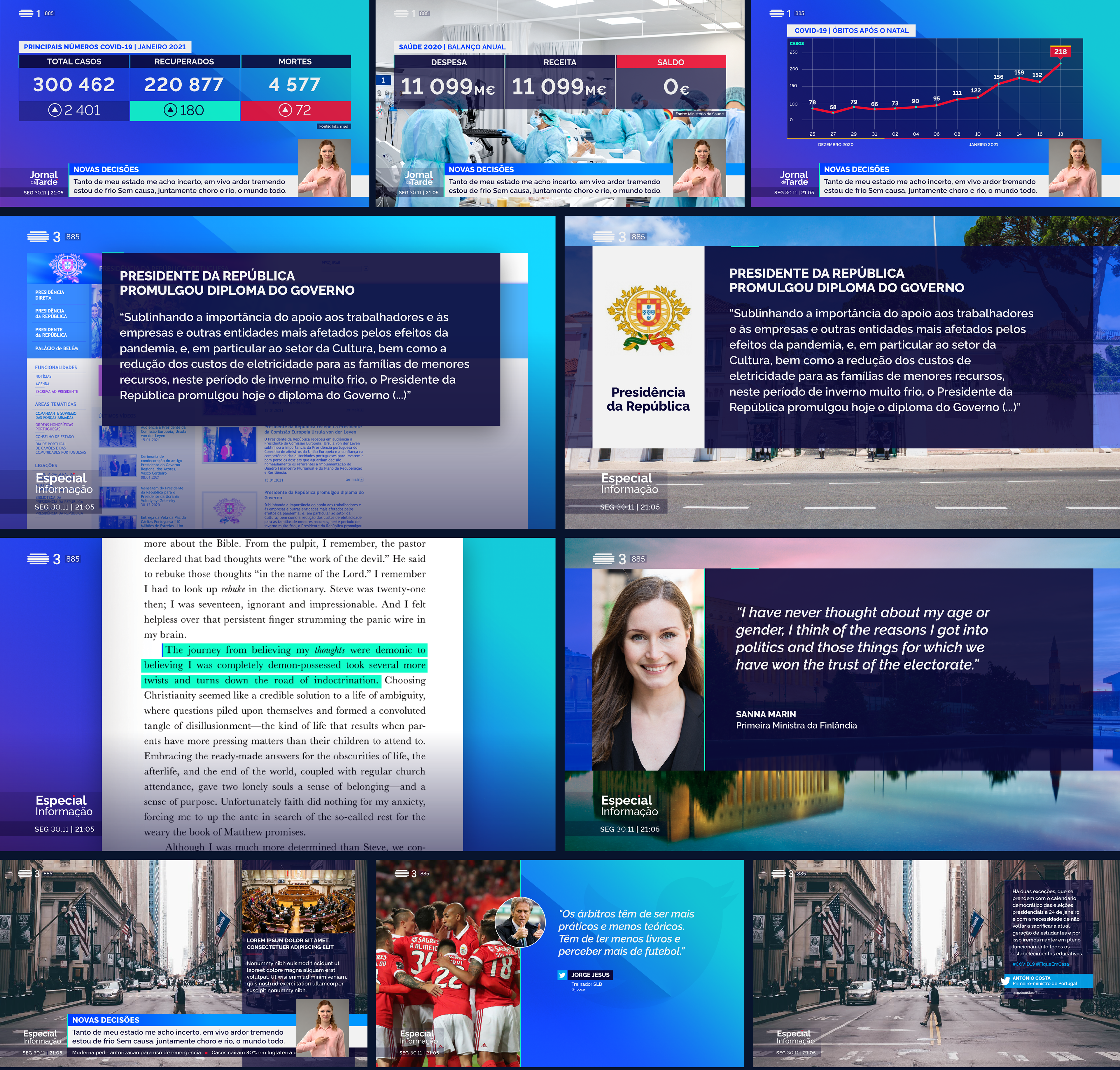
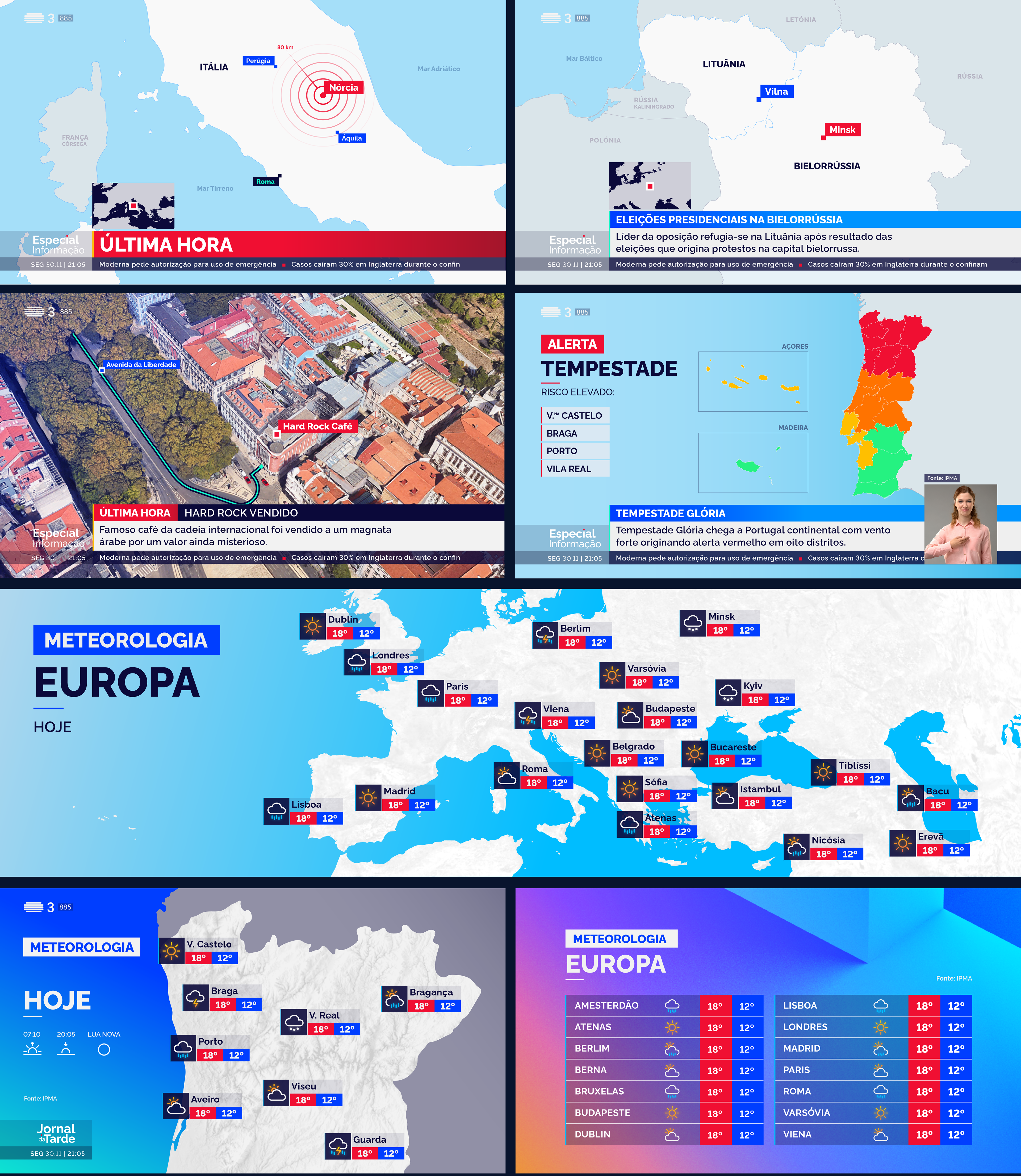
This case study is presented across five chapters: Teaser · Openers · On-Air Graphics · Infographics · Studio Ledwall Backgrounds. Focusing here on the Infographic System, covering Sport, Economy, General, and Maps & Meteo, designed for instant readability under live production conditions.
Infographic System
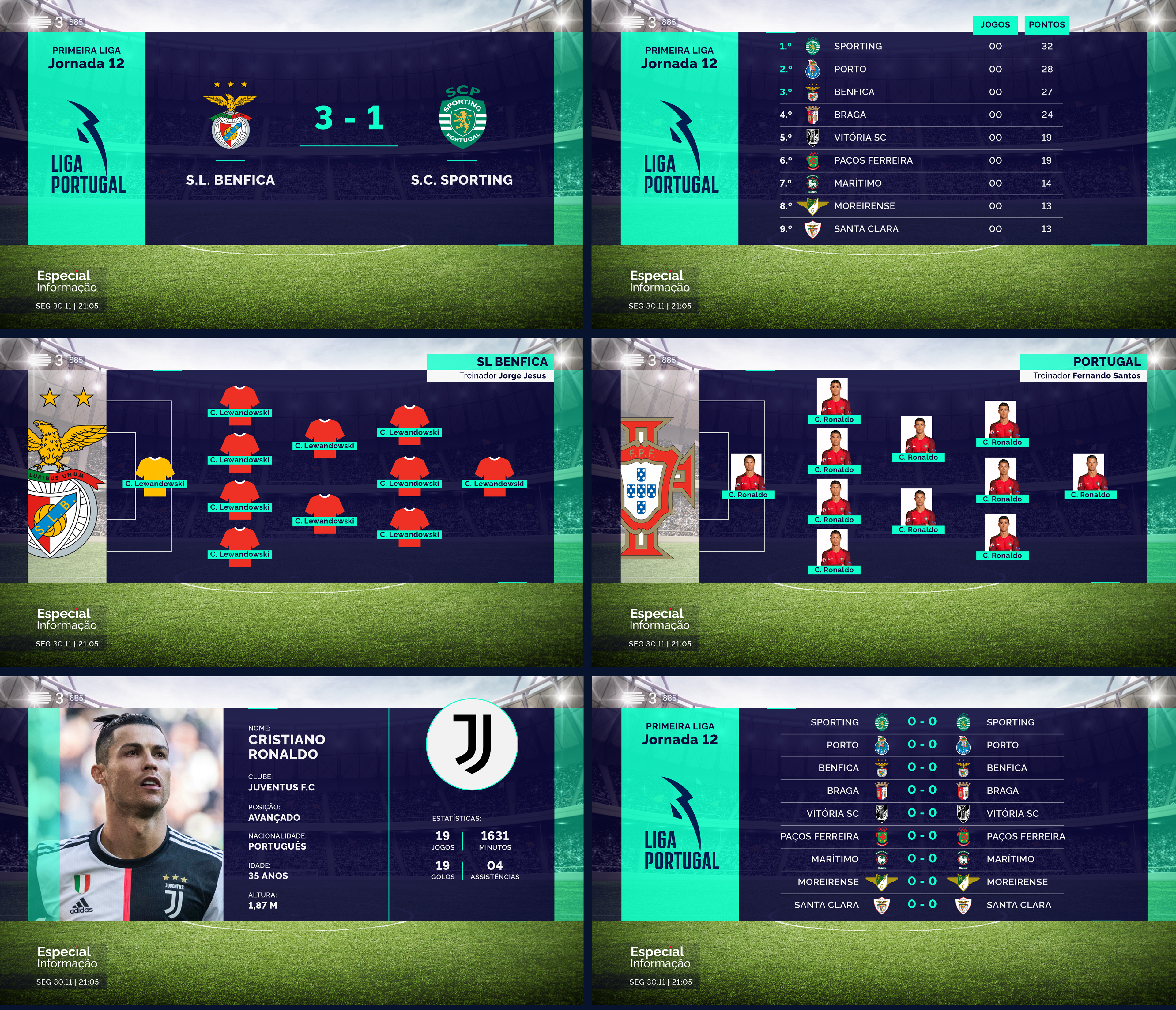
Sport
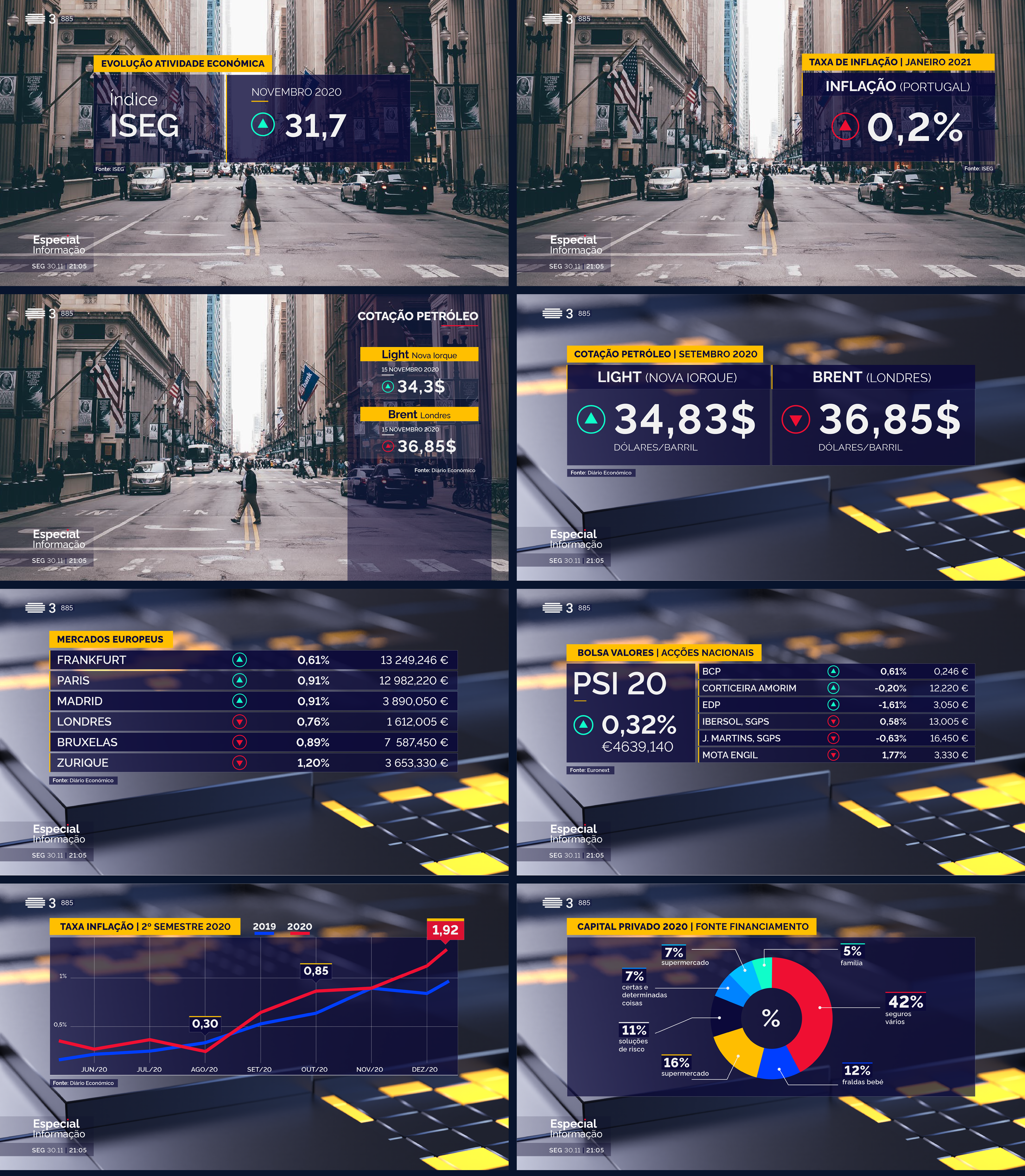
Economy
General
Maps & Meteo

THE SOLUTION
Color became the backbone of RTP's newscast identity system. Each news program was assigned a dominant color, creating instant visual recognition across the broadcast schedule. All graphic maps follow a strict minimalist iconography, balanced with neutral tones to ensure legibility under any on-air condition. Weather graphics were built on the same principle — simple, immediately readable shapes and strokes that communicate at a glance.
Animation is the thread that binds the system together. Rhythmic, organic transitions guide the viewer's eye through each information block, creating a seamless reading flow that supports rapid assimilation of journalistic content, even under the pressure of live production.
Full system overview